Flipside
Crypto
Rebuilding and redesigning a platform to increase monthly users.
Flipside Crypto needed an update to their Earn platform. Alongside the marketing team's brand-refresh initiative, my aim as the sole designer on the project was to define the platform's core problems from a user's perspective — then build a new design that would move monthly users toward the business target of 25,000 per month.
With no in-house designer, this was a challenge Flipside had been wrestling with for a while. My job was to put design and real user needs back at the centre of the rebuild.
The Problem — No Defined Journey
The existing product had grown without a designer to hold the line. There was no defined journey: users arrived, but the path from sign-up to a completed action was never deliberately shaped. An unclear user experience breeds frustration — and frustration drives the drop-off rate up.
Before proposing anything new, I needed an honest, evidence-based picture of where the platform was losing people and why.
Design Discovery
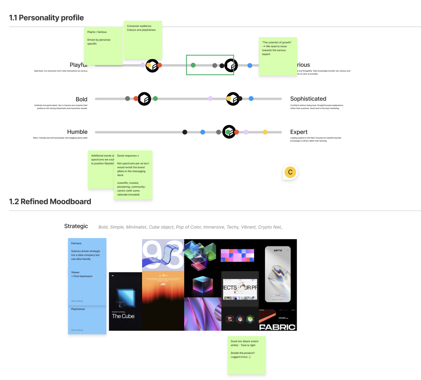
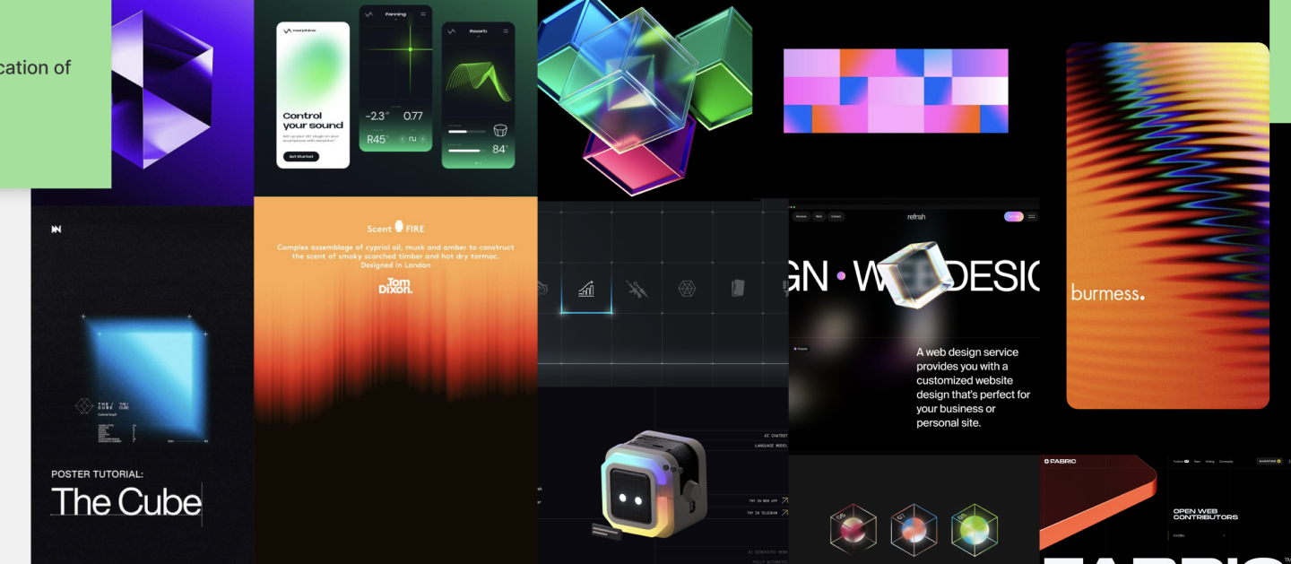
The first part of the study was to understand what stakeholders wanted out of the redesign. Seeing it from their side let me read the business context, and running competitive analysis with them gave an accurate gauge of where Flipside sat in the market.
Bringing stakeholders in this early earned real buy-in for the design changes ahead — so the work that followed wasn't a surprise, it was a shared bet.
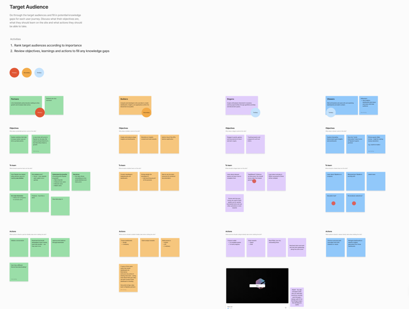
Design Audit & Research
To start, I wanted to learn the platform from a user's perspective. The first design carried a lot of assumptions; I wanted definitive answers on what we actually knew versus what we only believed. It began with a comprehensive design audit, then led into user research and interviews.
Several significant issues emerged — the experience was failing on more than one level:
- Onboarding fell down early, before users understood the value.
- UI hierarchy & consistency were off, creating a disjointed, hard-to-scan experience.
- There was no “golden” hand-holding to guide users through the journey.
- We gave no feedback to people who completed a journey — the loop never closed.
- Much of the messaging was unclear and difficult to understand.
“Sometimes delight is the things we don't have to think about.”
Turning Empathy into Action
Empathy, to me, is about putting myself in someone else's shoes. One strong message came out of my conversations with users: they were, for the most part, highly technical individuals — yet they still needed help understanding the platform.
Many arrived straight from Twitter with an already-formed idea of what they wanted to do. So the goal wasn't to dazzle them — it was to get out of their way. That's where the guiding principle landed: sometimes delight is the things we don't have to think about.
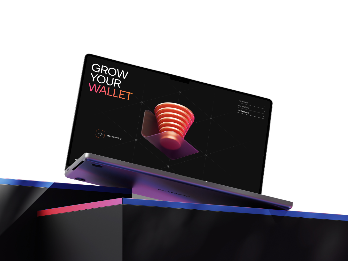
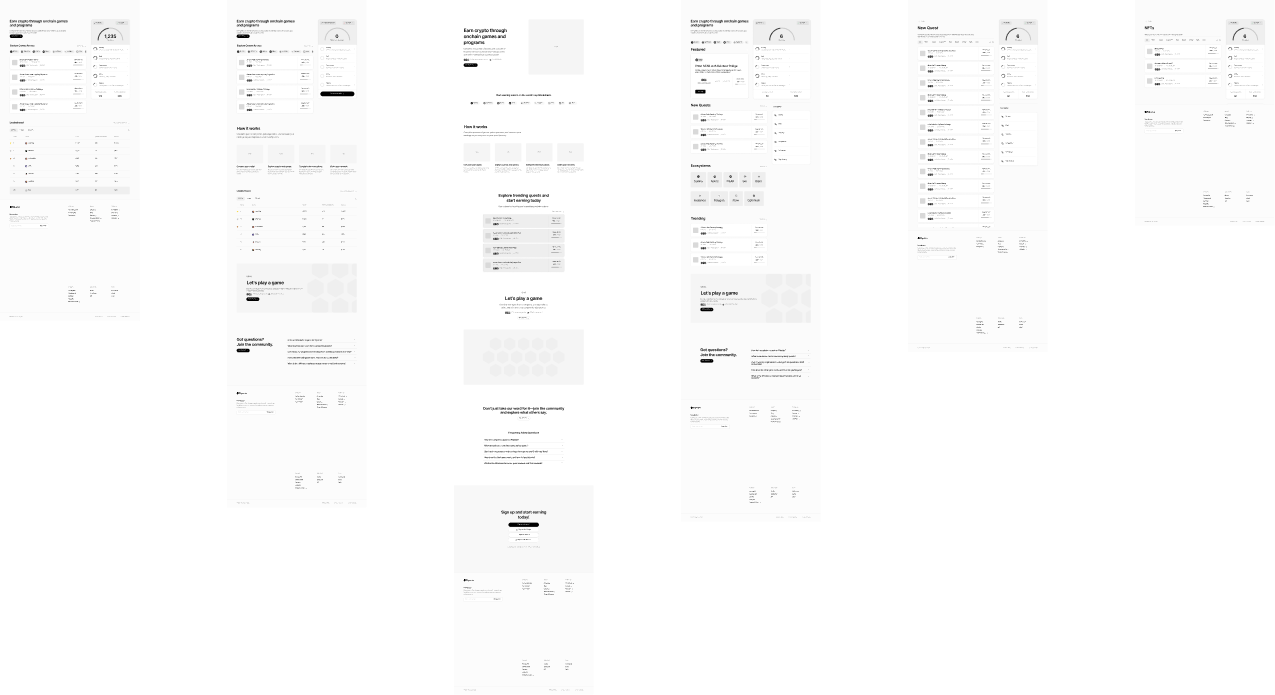
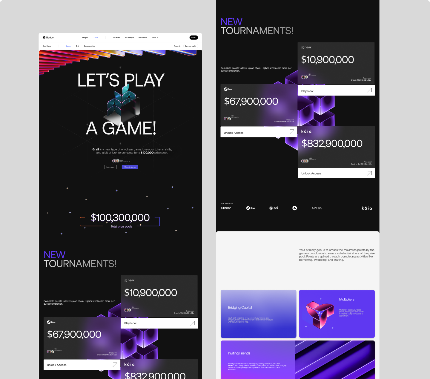
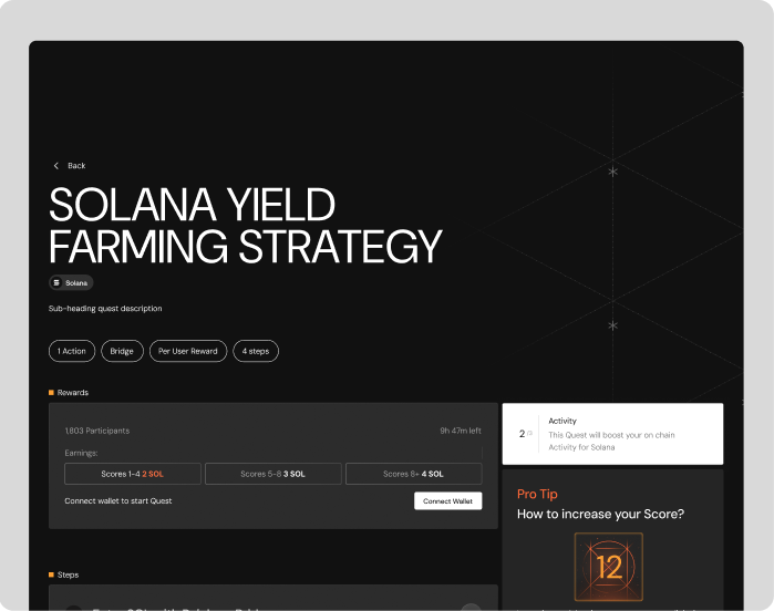
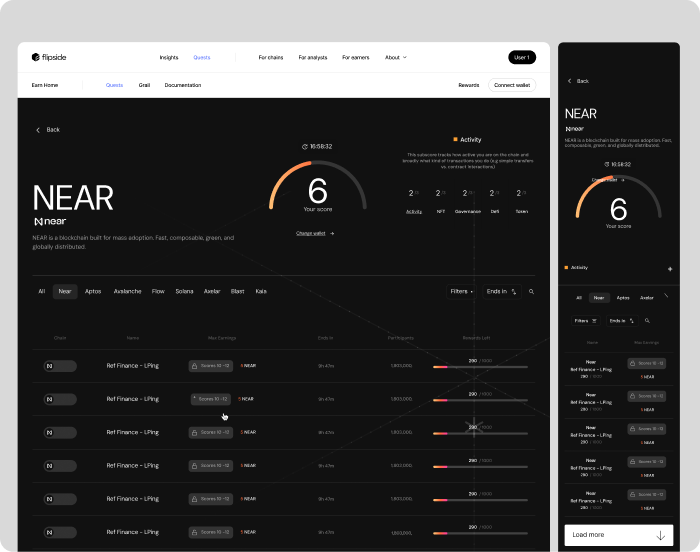
The Redesign
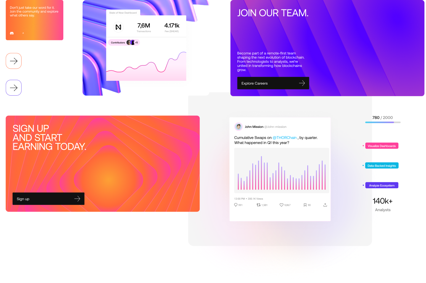
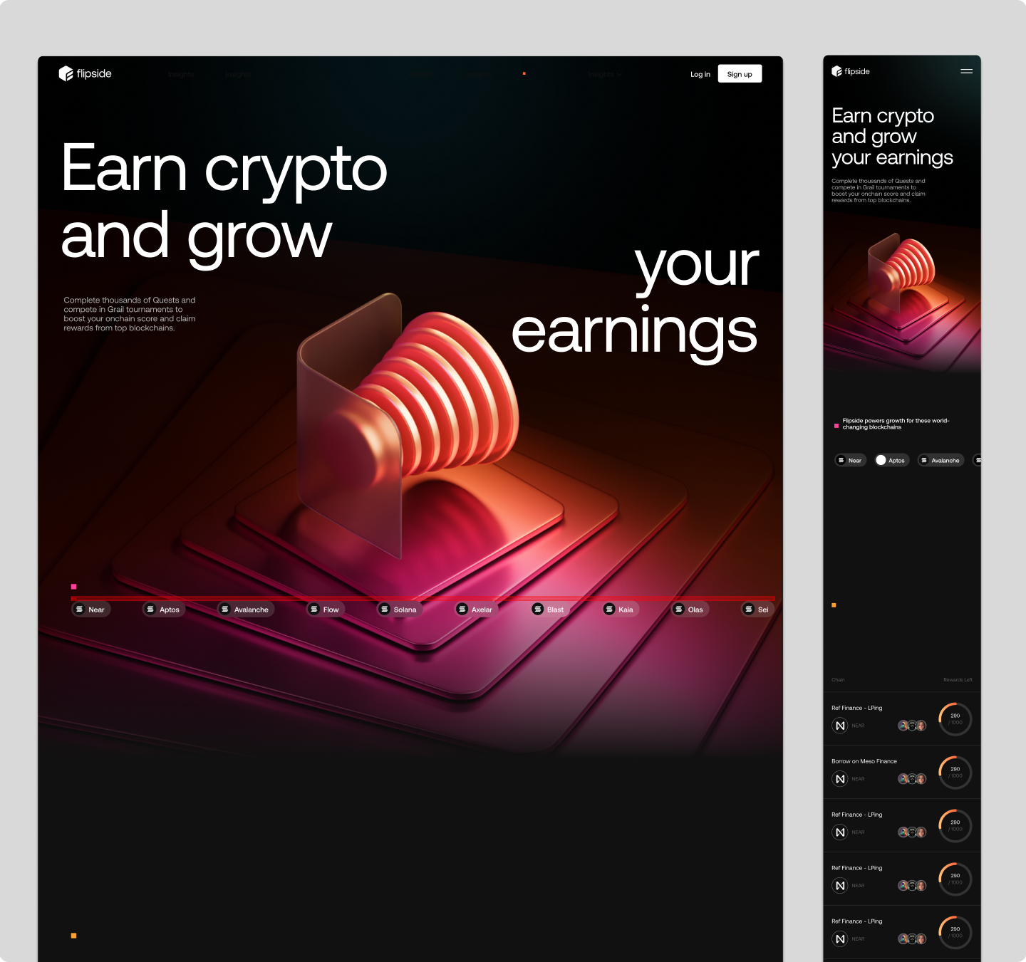
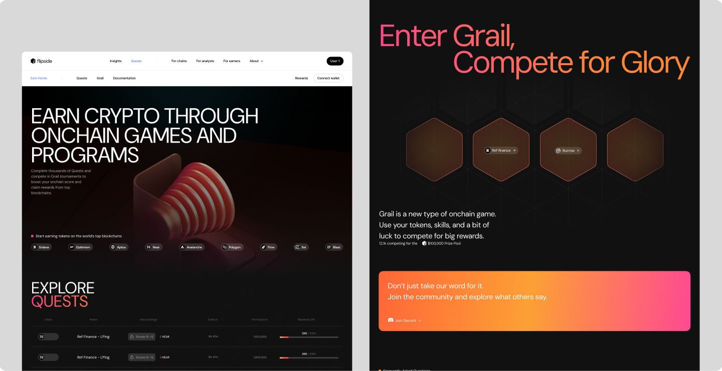
The new Earn platform replaced an undefined journey with a deliberate one: a consistent UI system, a clear visual hierarchy, golden-path onboarding, and feedback at every meaningful completion — all aligned with the refreshed brand.
Conclusion
By putting design and the user back at the centre, the rebuilt Earn platform swapped an undefined journey for a guided one — clearer hierarchy, a consistent UI, and the feedback loops that had been missing entirely.
The most durable outcome wasn't a single screen. It was a platform that finally knew where it was taking people — and a design foundation the business could keep growing on toward its 25K monthly-user goal.