Wio
Bank
Building the best place to see, manage & grow money.
Banking is no longer just a transactional necessity; it is a pivotal element that influences our lifestyle choices, financial well-being and personal goals. Money has transcended its traditional form — it has become a tool to achieve our aspirations.
Our aim was not to build another banking app, but to craft an experience that seamlessly integrates into the lives of users — redefining convenience, security and personalisation in the digital age. This is the story of how we set out to reimagine the future of banking in the UAE, one innovative step at a time.
Banks Are So Last Century, People Are Not
Banking is no longer just a transactional necessity. It is a pivotal element that shapes how we live, how we feel about our money, and whether we ever reach the goals we set for ourselves. The institutions hadn't kept pace with the people they serve.
How can we revolutionise the banking experience to resonate with the modern customer's lifestyle, happiness, and the evolving framework of daily life?
The Design Challenge
Our primary objective was to comprehensively understand and articulate the problem we set out to solve, and to gauge the impact it could have. We wanted to clarify how the project would enhance the customer experience and unlock new business opportunities — extending Wio's mission.
Our conceptual approach to how people interact with money was captured in a simple yet profound framework we called “Paths” — a guiding principle to help users navigate their financial journey toward freedom. Paths segmented financial planning into three horizons:
- Today — the money spent now, immediate everyday expenses.
- Tomorrow — short to mid-term goals like rent or a car loan.
- The future — long-term investments like a mortgage and retirement.
Defining the Audience
In redefining our user personas we moved beyond traditional demographic categories. Instead, we focused on understanding individual financial motivations and behaviours. Drawing on psychological research, we explored the concept of money personalities, blending this qualitative data with quantitative spending patterns.
This comprehensive approach helped us create personalised experiences deeply attuned to individual financial attitudes and habits. The goal was to empower users with intuitive, engaging tools that foster smarter financial decisions through a genuinely user-centric process.
Charting the Emotional Journey
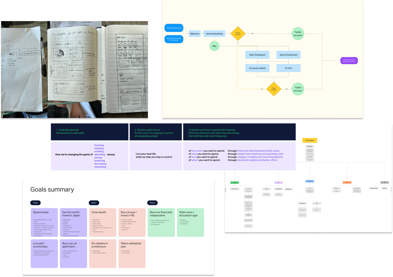
We first established a clear information architecture to serve as the app's navigational backbone, ensuring seamless connections between sections. This was vital for understanding the user's financial journey.
Next, I created an emotional journey map focused on the emotional aspects of managing money. This surfaced the critical moments to integrate educational content — offering guidance and reassurance as people navigate new ways of managing their finances, so they feel equipped and confident at every step.
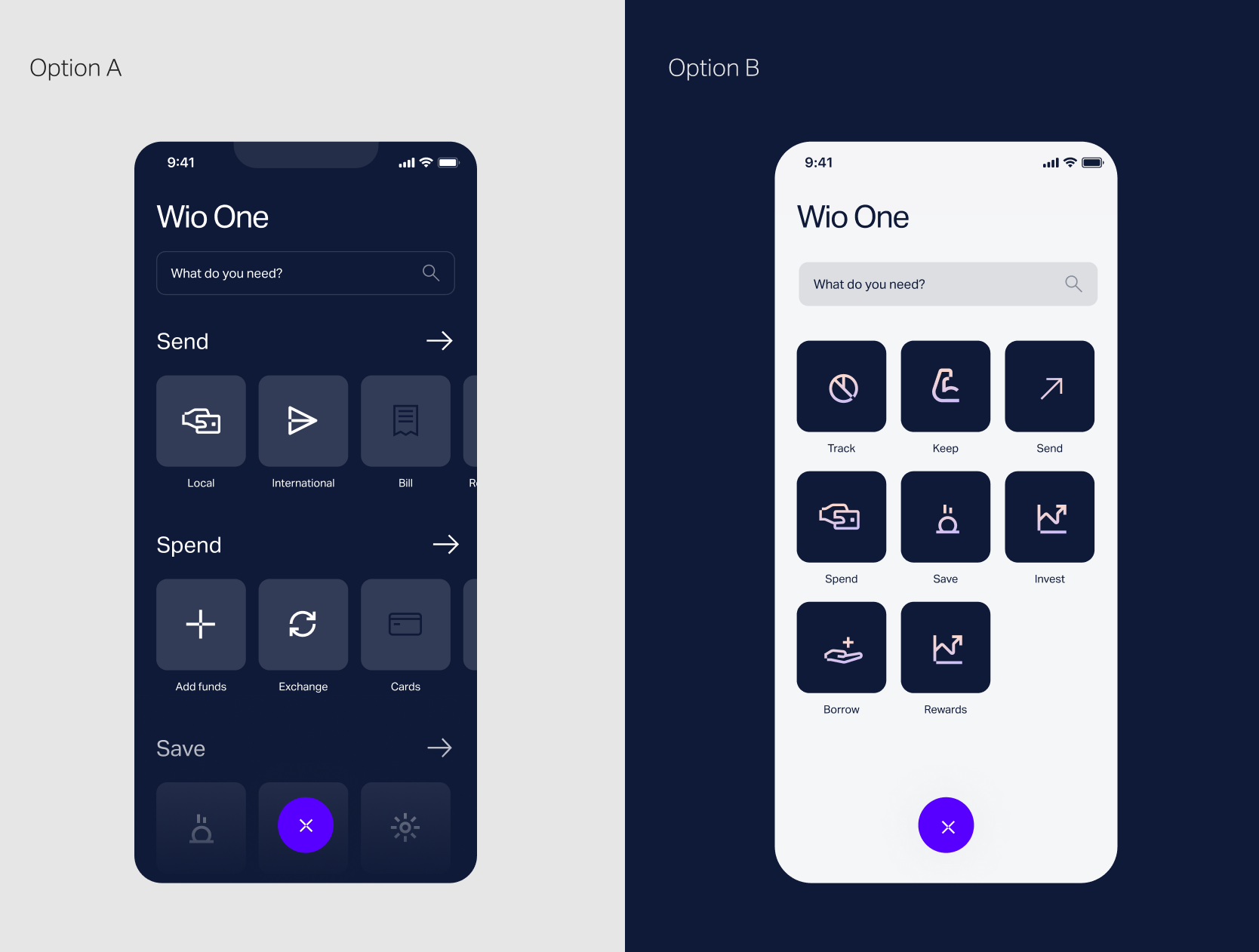
Insights & Planning
My focus on the Spend section involved iterative design — building multiple prototypes to refine how people interact with their financial data. A few clear directions emerged from the planning work:
- A central hub to enhance navigation, giving easy access to the various financial features in one place.
- An effective budgeting tool, shaped by user insight to be both simple and engaging.
- A Jobs to Be Done framework, translating insights into purposeful app features.
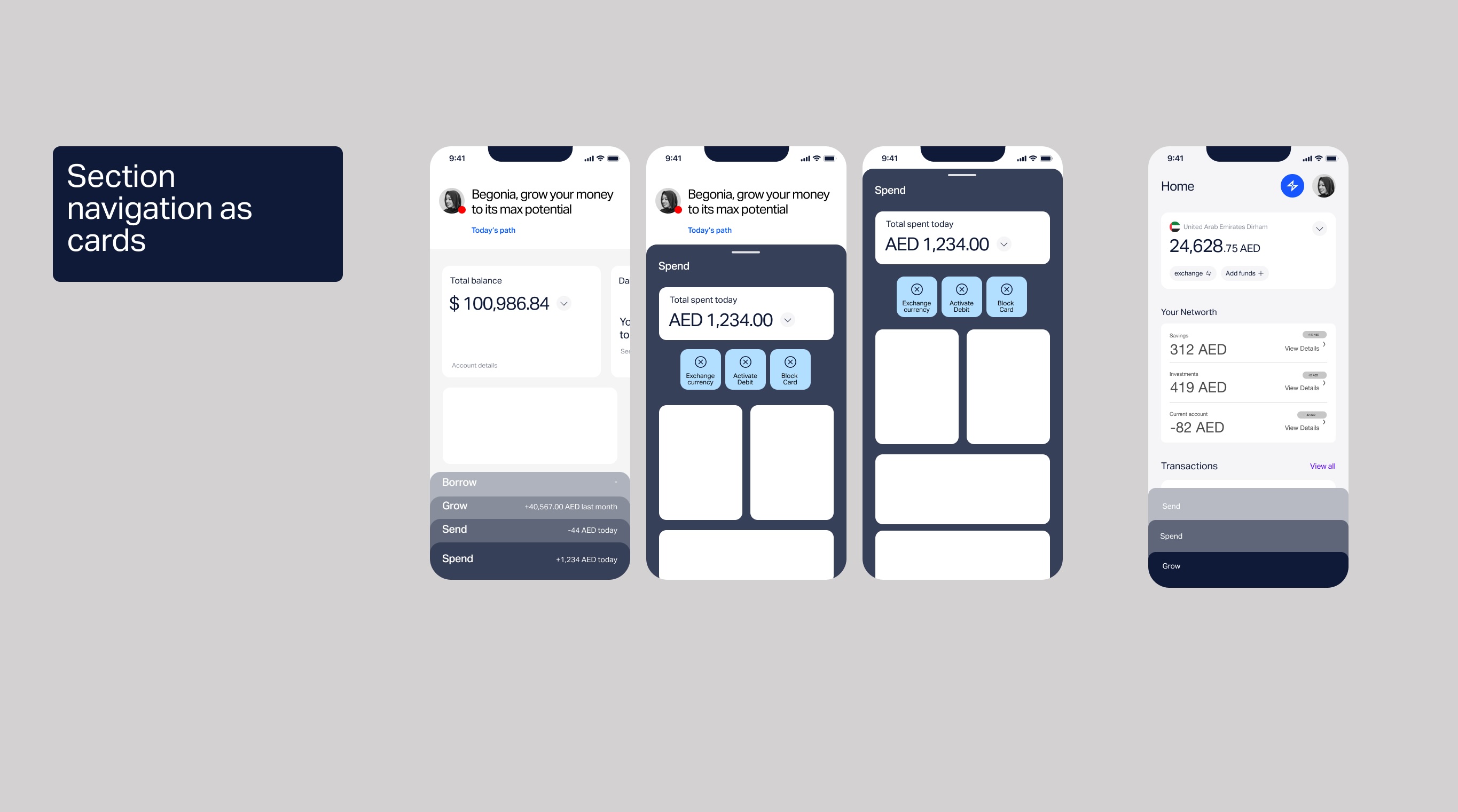
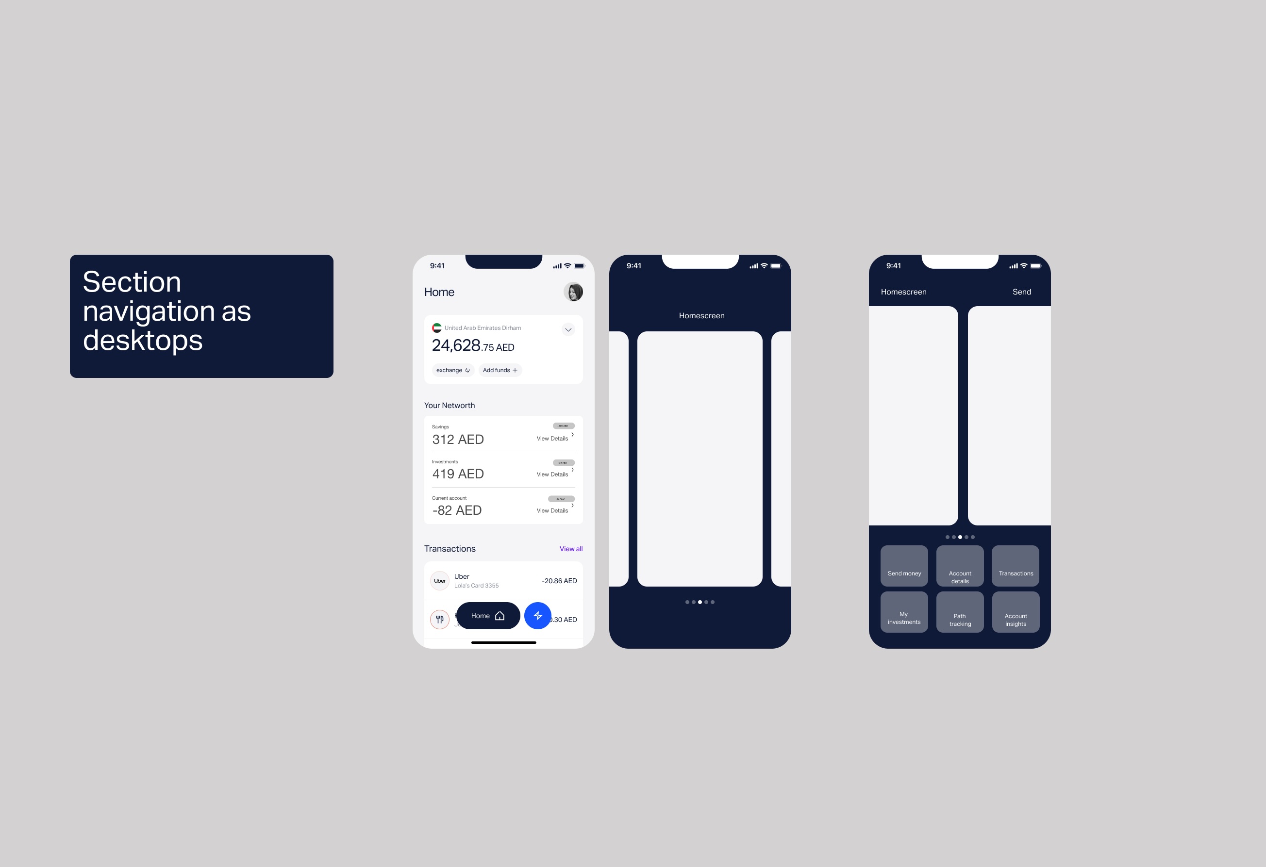
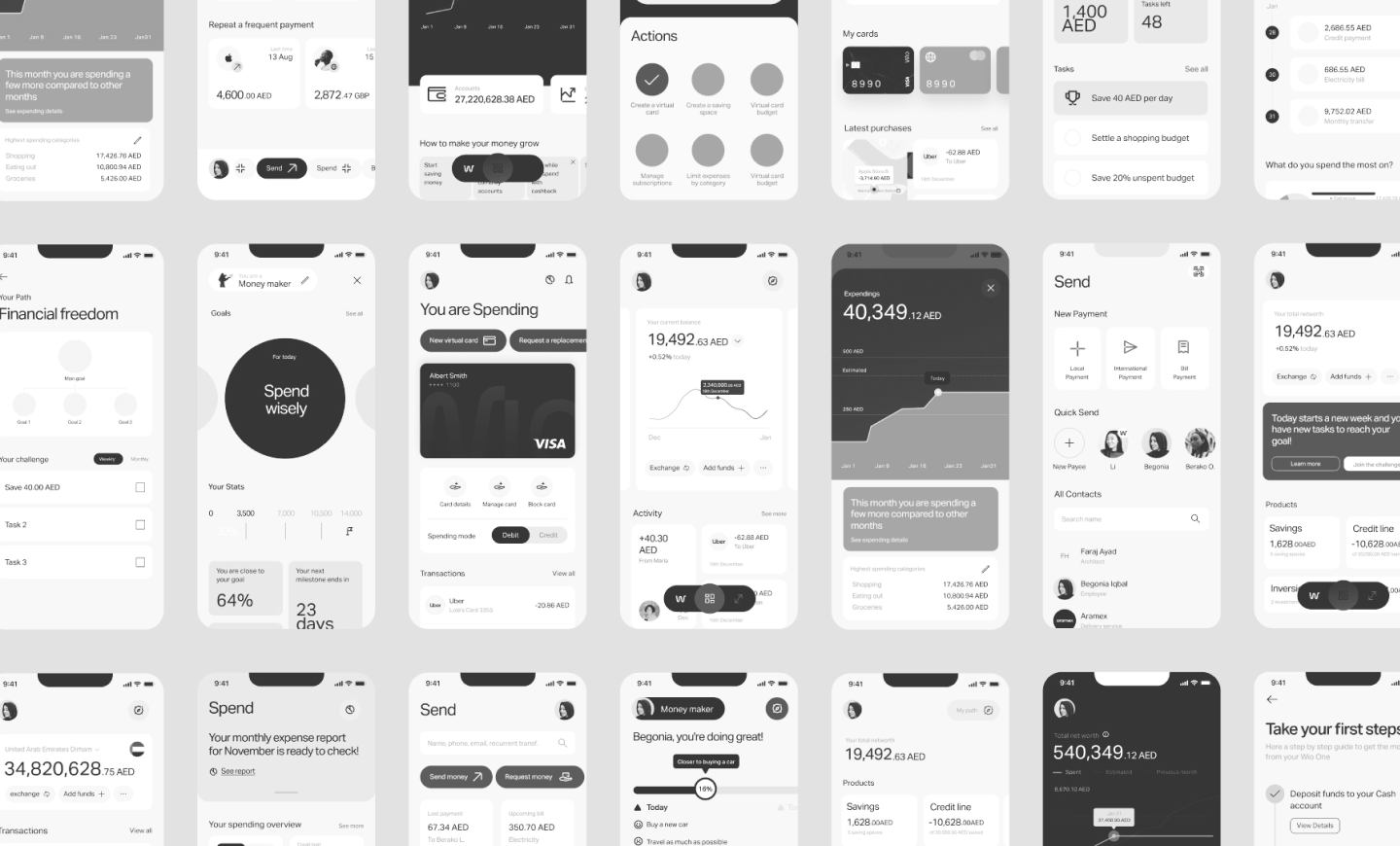
Exploring Components
With the Spend section as my focus, the iterative design ran deep — creating dozens of modules and components to represent financial data in ways people could actually parse. As a team we explored hundreds of options.
Navigating the App
Navigation had to carry the whole experience. We pressure-tested how people moved between accounts, spending and goals — pushing variations of the core flows until the path through the app felt obvious rather than learned.
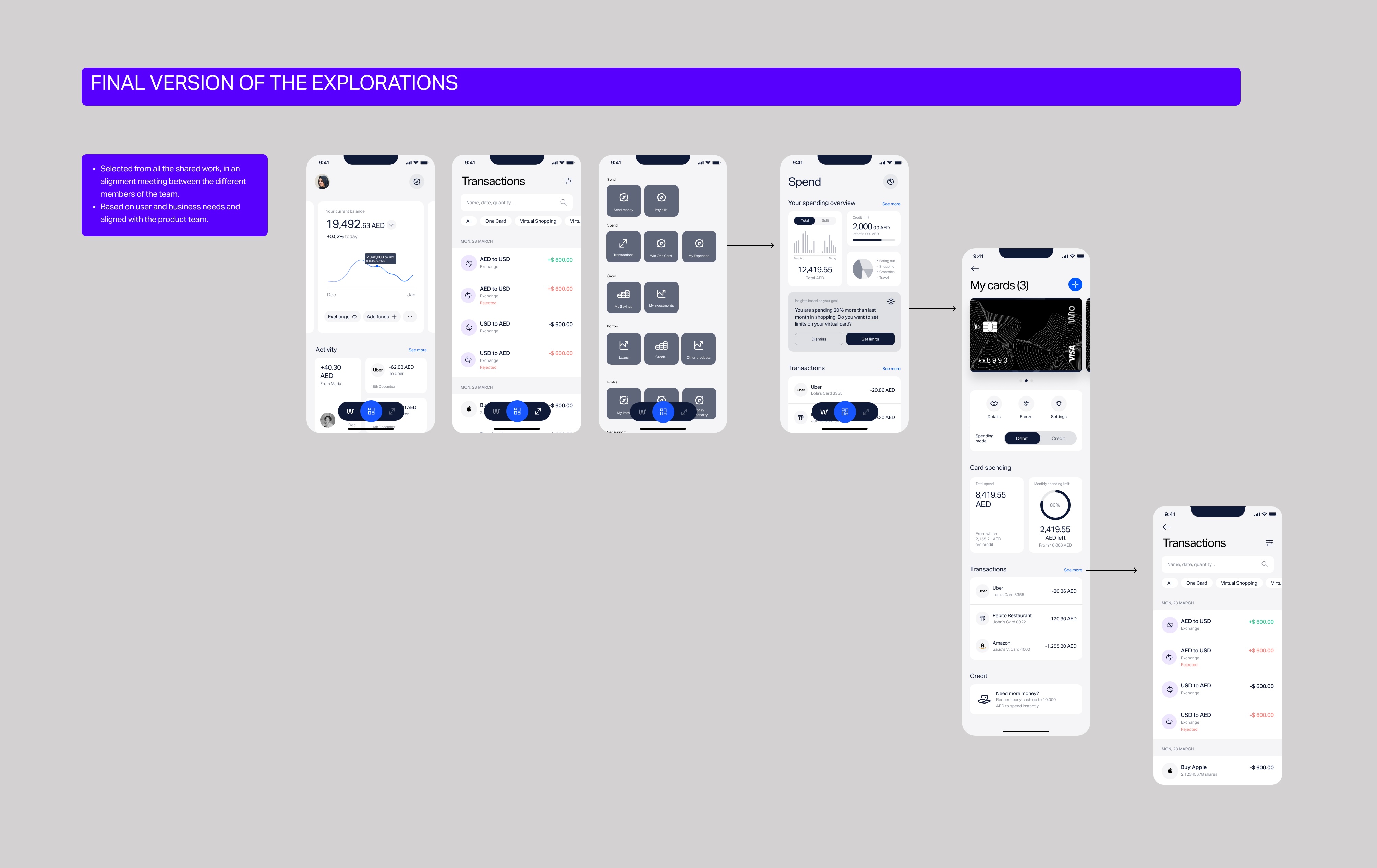
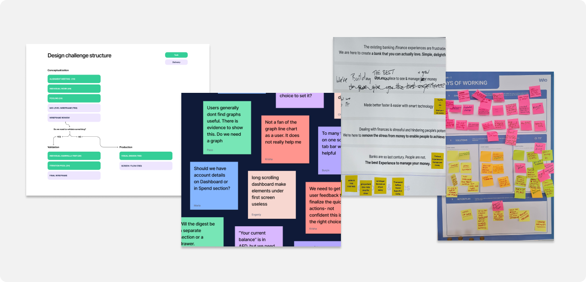
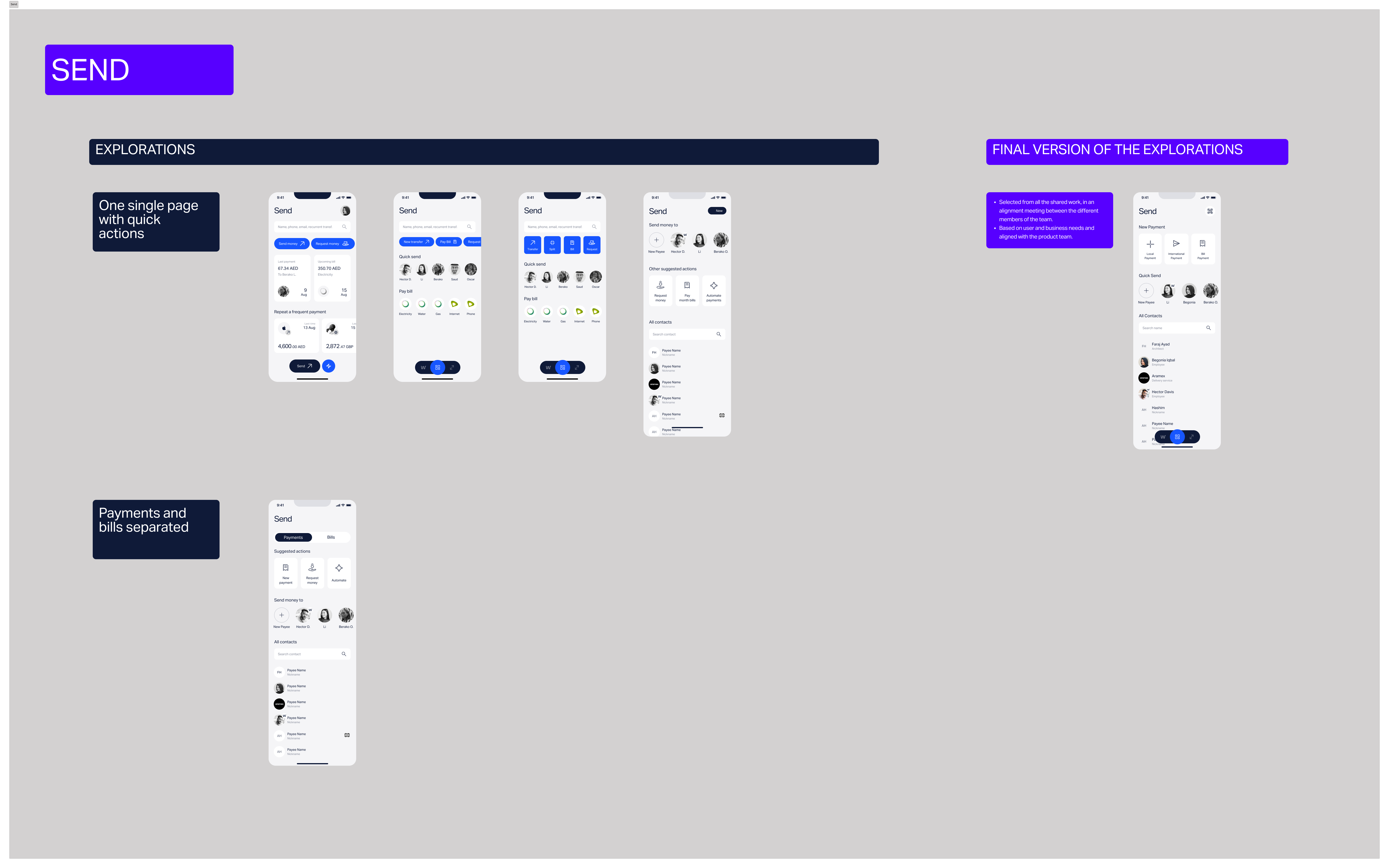
Design Explorations
Taking account of every insight from competitor analysis, team design workshops and customer feedback, we turned what we'd learned into design explorations. Testing them within the team informed the final design.
Through a diverse exploration of styles and executions, we solidified the visual bedrock that supports the entire experience. Designing, prototyping and testing each element of the interface were critical steps — and that commitment to repeated refinement is what transforms a simple banking transaction into an empowering financial experience.

“We are revolutionising the way people interact with their finances — focusing on control, simplicity, excitement, clarity, delight and support.”
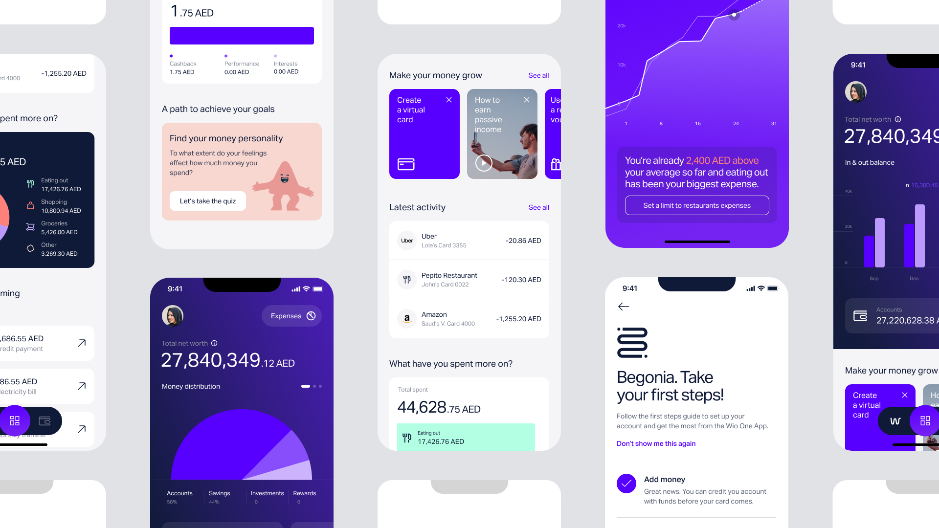
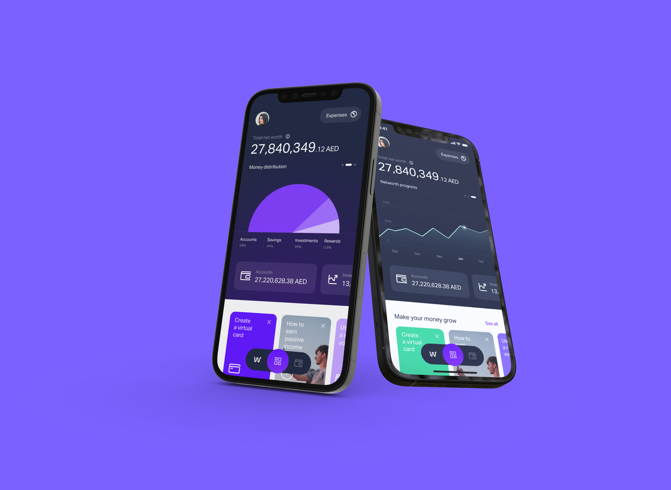
What We Created
As we crafted a banking experience that resonates with modern needs, our approach to visualising the UI played a pivotal role in shaping Wio's identity. We sculpted six pillars of design — they led the process and acted as the anchor for the work.
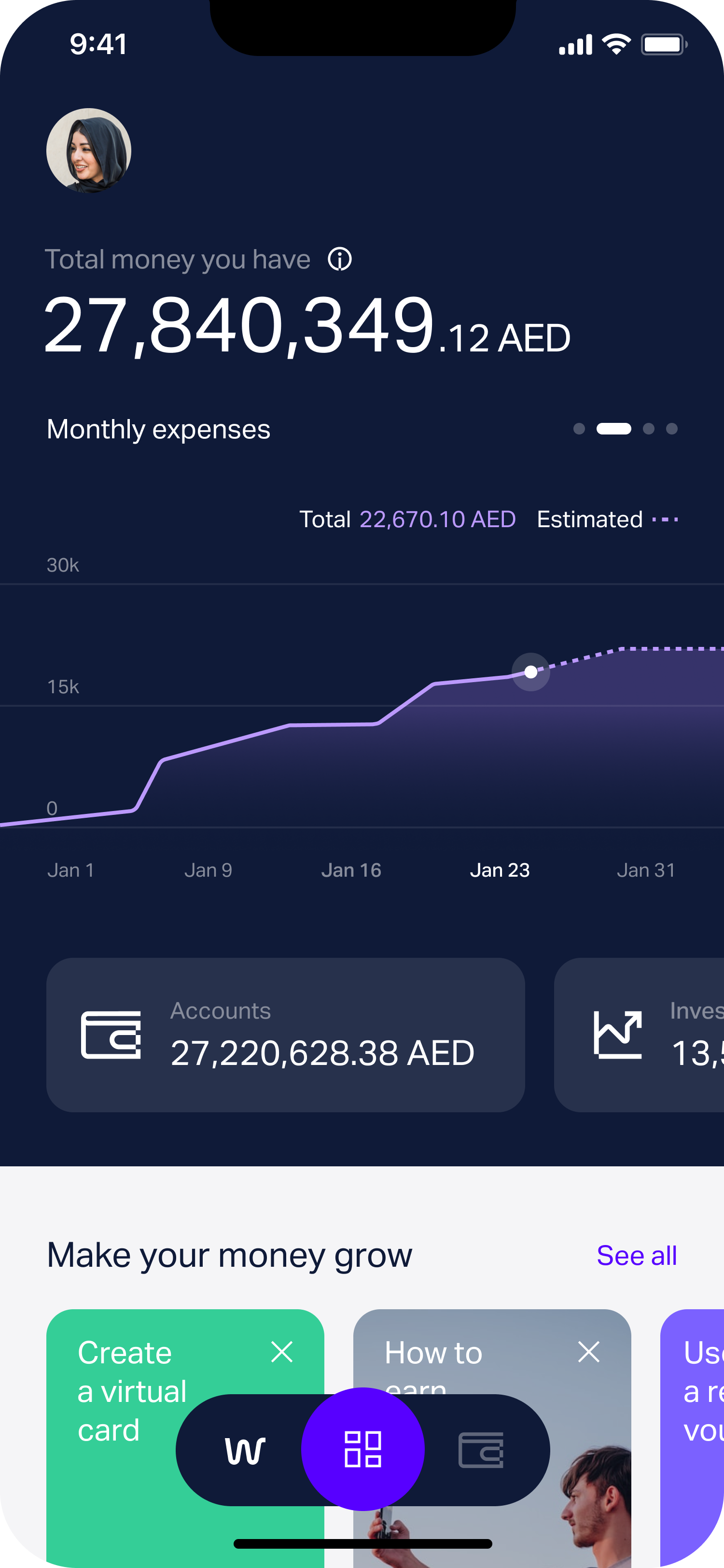
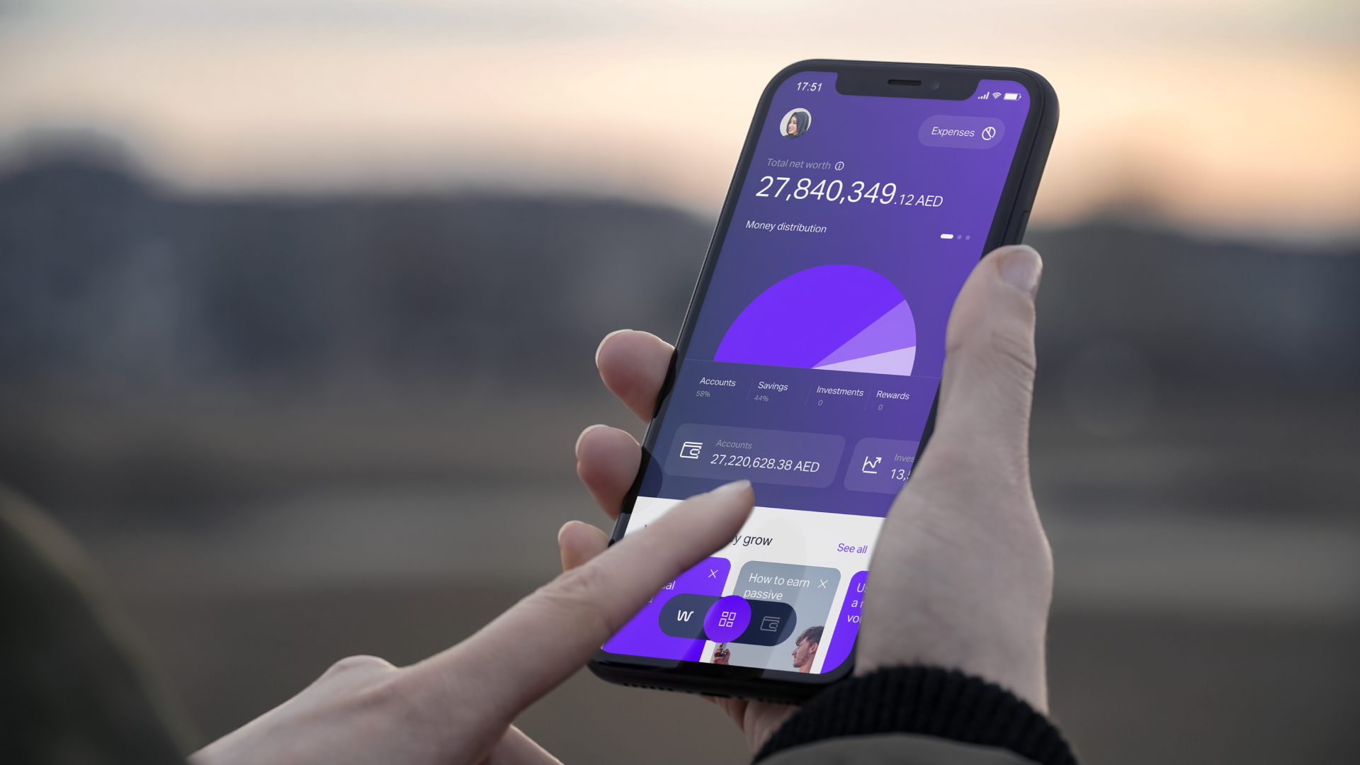
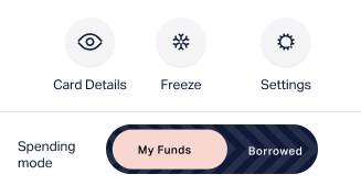
- Control — seamlessly switch between your own funds (debit) and borrowed funds (credit) for any expense, across virtual cards, savings, crypto and stocks, with limits on overall or category spending.
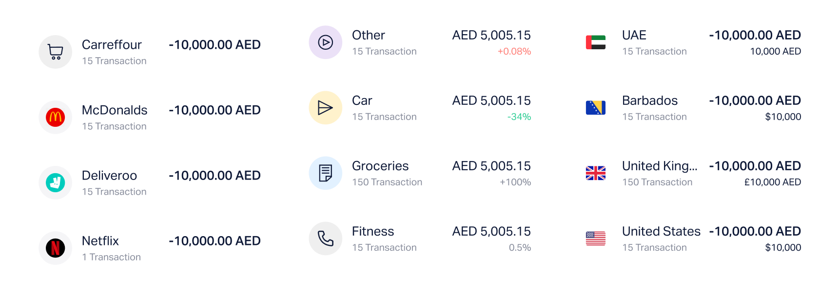
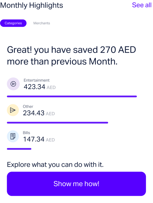
- Simplicity — view spending by category, merchant and overall trend, with actionable insights that make it easy to see where money goes each month.
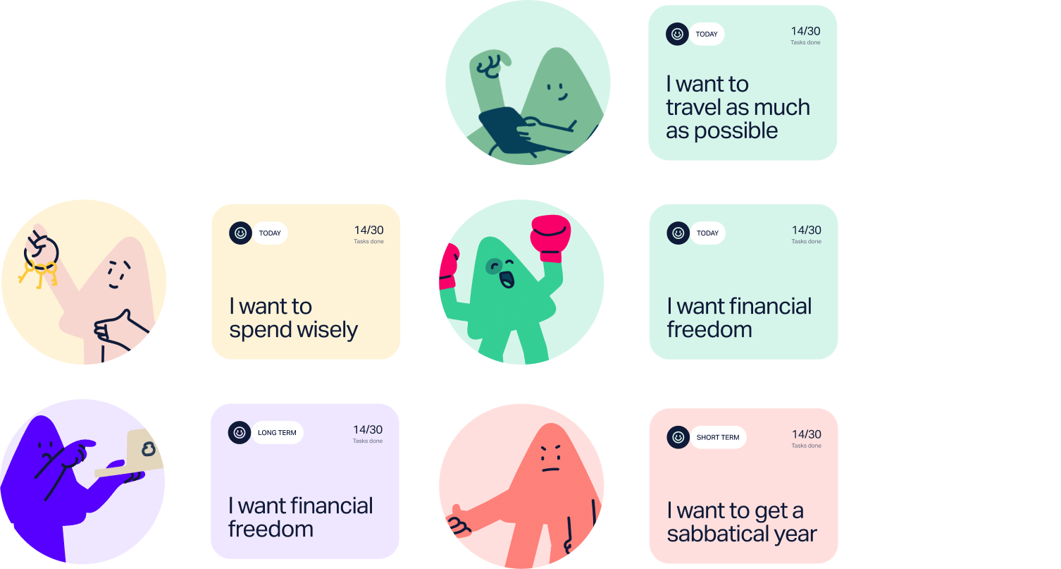
- Excitement — a money-personality assessment that helps people understand their patterns and tailor their Wio experience.
- Clarity — spending categories, timeframes and trends presented in an easily digestible format, with the complexity stripped away.
- Delight — insights and recommendations that anticipate needs, turning everyday transactions into moments of discovery and reward.
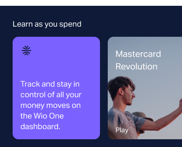
- Support — a rich library of articles and resources so people learn as they spend and build real financial acumen.
Our Approach to Innovative Banking
At the core of our process lies a belief in the transformative power of dialogue. To truly innovate in banking, we had to first listen — to stakeholders, to financial experts, and most importantly, to our customers. Those conversations were the seeds from which the strongest solutions grew, guiding us to understand the real issues people face on their financial journeys.
After refining the designs, we moved into an agile development phase, staying in close collaboration with our engineering team to ensure every design was fully prepared for each sprint. The most durable outcome wasn't a single screen — it was a banking experience that finally felt connected to the lives and goals of the people using it.