Burberry
In the store they bring you champagne. Online, they asked for thirty answers.
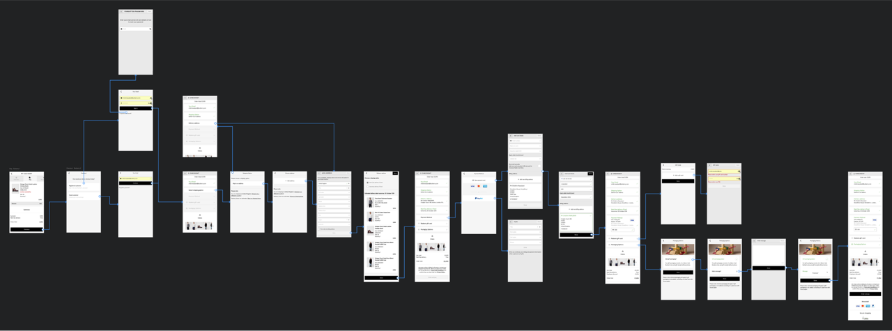
A £600 scarf shouldn't take three minutes and six seconds to buy — least of all from a brand whose in-store promise is stillness and quiet care. This is how Burberry mobile checkout went from 3:06 to 2:01 — and why every decision was really about how much friction a luxury purchase can survive before it stops feeling like one.
Regent Street sells the feeling. Mobile.burberry.com sold a form.
Walk into the Regent Street flagship and an associate meets you at the door, offers a seat and a glass of champagne. Nothing feels like a transaction. That's the point — it's what the brand sells above the leather.
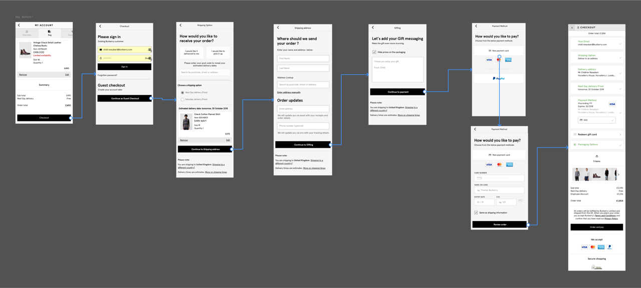
Buy the same scarf on Burberry.com and the checkout sends you sideways for an address, sideways again for a delivery date, sideways again for payment. By the time the pay button appears, the moment has passed.
“Checkouts are the only part of the shopping experience where we want customers to leave as soon as possible.”
— Working note, opening of the audit deckThat line topped every deck. It flips the usual model: in a checkout, every extra beat is a chance to close the tab, doubt, or simply notice how much work they were doing. In luxury, that noticing is fatal — the whole promise is that you shouldn't have to.
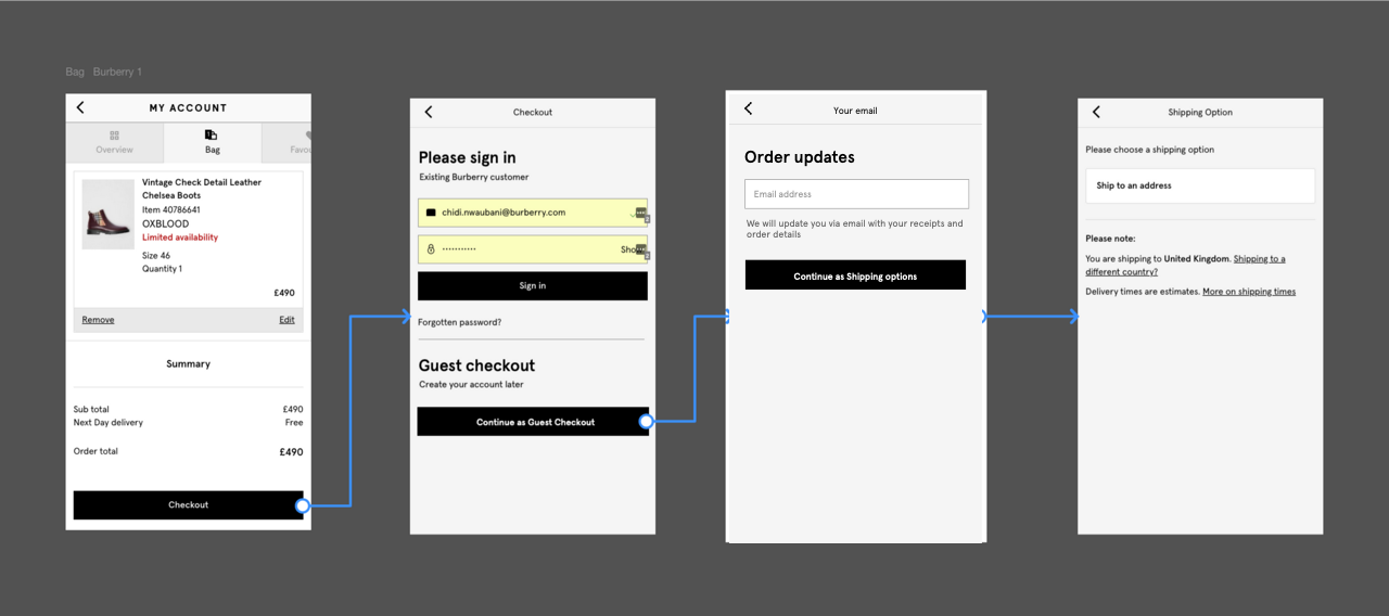
Ten sections. Thirty answers. Six redirects. To buy a scarf.
Before proposing a change, I walked the whole flow and tallied it. Not “does it feel long?” — how many decisions, inputs and context-shifts. The numbers told the story:
Thirty inputs was a tax the customer paid for the brand's operational convenience. Six redirects meant no one had mapped this end-to-end — ten small, sensible experiences that added up to one senseless one.
That set the bar before I drew a screen: if a change didn't cut sections, questions or redirects, it wasn't a “quick win.”
Why a checkout that “just works” is not enough here.
Most checkout advice is tuned for a price-sensitive, comparison-shopping customer who forgives friction if the price is right. The Burberry customer isn't that: they're paying £600 for a scarf whose functional equivalent costs £30. They're buying the feeling — and friction that interrupts it doesn't just cost conversion, it strains the brand promise.
Four effects were doing quiet damage:
Cognitive Load
Every unnecessary object taxes working memory. On a phone screen, often on the move, a dense checkout tips the customer into overload they can't name — they just feel it, and leave.
Hick's Law
Decision time rises with the choices in view. Ten sections meant ten “what next?” moments — each screen a fresh set of options with no clear next.
Aesthetic-Usability Effect
Beautiful things read as more usable — until they don't. The checkout was gorgeous screen by screen, which buys goodwill on screen one and almost none by screen six. When aesthetic and experience diverge that far, the halo reverses into disappointment.
Peak-End Rule
Customers remember the worst moment and the last. If the peak is a confusing address form and the end is a hidden submit button, that's what they remember about buying Burberry — not the product page three minutes earlier.
Analytics told me what. Thirteen real luxury shoppers told me why.
The analytics team was sitting on numbers that justified the project alone. I pulled the shape in numbers first.
Business case
Mobile conversion had dropped −25% YoY while traffic grew +63%— a growth story hiding a loss. Held flat, that's ~£11M in mobile demand quietly uncaptured.
Cross-platform
Across mobile and desktop, the same model showed ~£14.6M in potential demand for the year. The rec: fix checkout on both, prioritise mobile (biggest number), drive more traffic to the bag on desktop.
“Analytical data can tell you exactly what is happening on each page. It cannot tell you why certain things are happening. For that, we needed user testing.”
— Research readout, week threeQuant told me where customers dropped and how often — not what they were doing when they dropped. So I ran a small, sharp study to answer the why:
Who we tested with
13 luxury shoppers (8 remote, 5 in-person), iPhone X only, £80k+ income, all recent buyers from Celine, Gucci, Balenciaga, Louis Vuitton, Saint Laurent, Givenchy — plus Burberry. Not a proxy for the customer. The customer.
What we tested
The current checkout head-to-head against the redesign. Scenario: buy a scarf as a gift and think aloud. Test cards supplied, no real transactions.
One participant could not check out at all.
She's Gold-card at Selfridges, has bought Burberry for a decade, on a £1,000 iPhone in a soft-lit test room, with a scarf for her mother's birthday in the basket. She reaches billing address. She types, taps, scrolls, goes back and forth, re-checks the labels — and, thinking aloud, says quietly that she doesn't know what the form wants from her.
She doesn't finish. Not because she doesn't want to. Because the form won't let her.
One blocked user in thirteen isn't a statistic — it's a P0. The same friction across tens of thousands of sessions is the −25% year-on-year the analytics only showed the surface of. Qual triangulated quant — which is why both exist.
“One user was unable to checkout using our current process. This raises a critical issue in the billing address stage which has been noted and needs to be addressed as a priority.”
— Test readout, findings section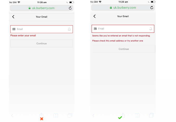
Eight decisions. Eight psychology principles. One flow.
The “quick wins” redesign wasn't a rebrand — it was eight specific decisions, each targeting an effect that was costing completion.
Decision 01 · Visual Hierarchy
One clear focal point per screen. Everything else, quieter.
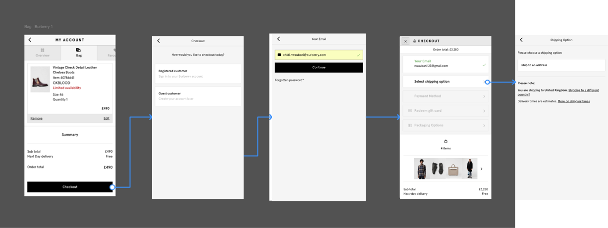
The old checkout used body copy for every instruction — nothing told the eye where to go first. The redesign restored the type system: one primary heading per screen, supporting text below. The difference between an obvious next step and a guessed one.
Decision 02 · Peak-End Rule
Error messages that don't taste like the peak they'll become.
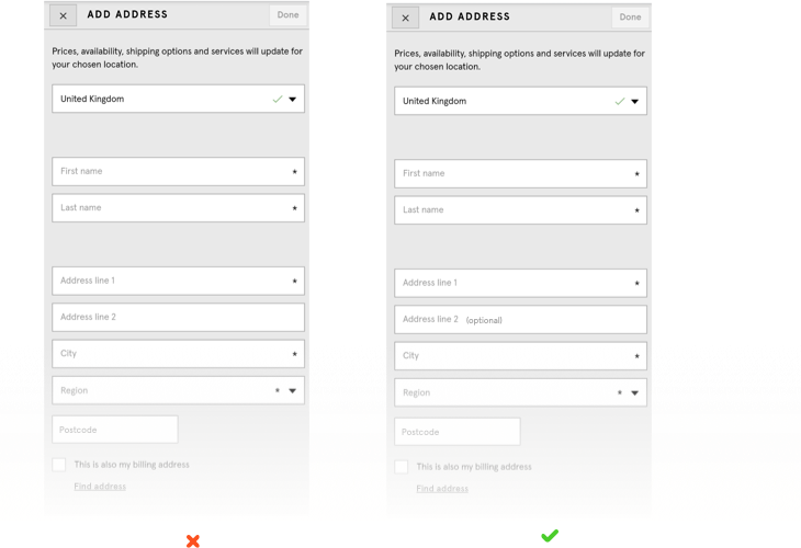
A generic error is the peak the customer remembers — champagne turning into a call centre. Every message got rewritten to answer two questions: what went wrong, and what do I do now? No codes, no blame — a peak you can recover from without leaving.
Decision 03 · Cognitive Load
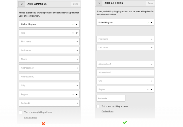
Every question earned its place — or was cut.
For each of the 30+ questions I asked: does the business need this to fulfil the order right now? Anything that didn't clear the bar moved to post-purchase — where the customer has already transacted and is happy to share.
Decision 04 · Chunking
Semantic groups that respect the 7±2 rule.
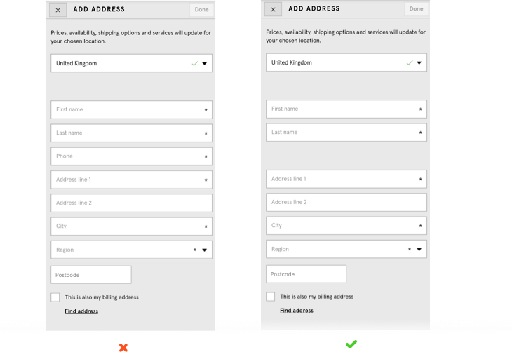
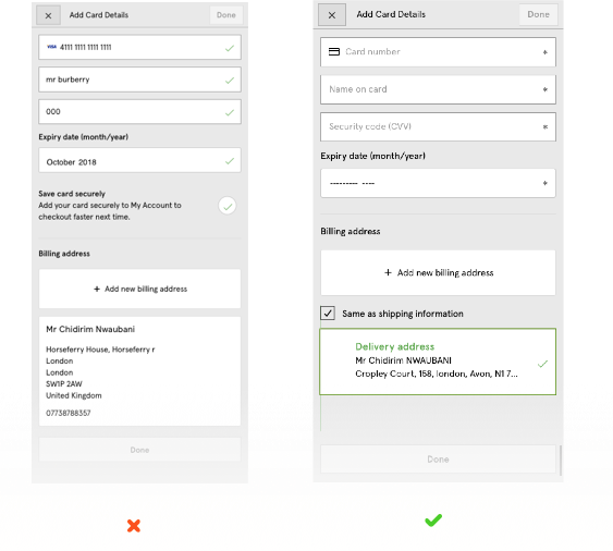
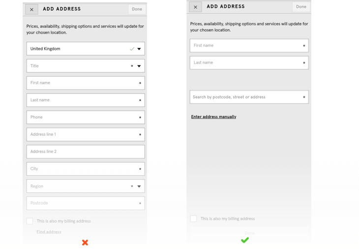
Grouping fields by meaning — name together, address lines together, card number in the shape of a card — turns a form into a sequence of small, obvious commitments. Thirty fields in six chunks of five respects Miller's 7±2; thirty in one block doesn't. Same information, half the felt load.
Decision 05 · Default Bias
Mark the exceptions, not the rule.
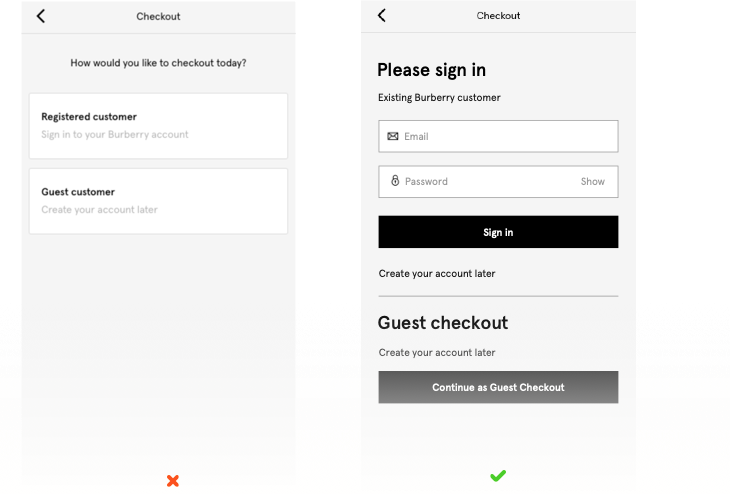
The old form asterisked every mandatory field — and when almost everything is mandatory, the asterisks are noise. The redesign flipped it: mandatory is the unmarked default, optional gets called out. Faster to read, and permission not to fill something in.
Decision 06 · Transparency & Trust
If we ask, we say why.
Phone number is the classic: customers resist it, but there's a real reason (SMS delivery updates). The old checkout asked without explaining; the redesign gave a one-line why under the label — and a way to skip it for email. Extractive versus considerate.
Decision 07 · Recognition Over Recall
Show me my address. Don't ask me to remember it.
The billing-address section blocked our test user — empty fields filled from memory, labels subtly different from shipping. The redesign wired in address lookup as the primary input: recognise your address in a dropdown instead of reconstructing it on a phone keyboard. This one change alone would have unblocked her.
Decision 08 · Signifiers
The button has to look like a button.
One screen's primary CTA didn't read as interactive — flat, no elevation. Participants reached the end and stalled, unsure there was a next step. Every primary CTA got a consistent, unmissable treatment. Small change, measurable clearing of the stall.
Accessibility isn't a section. It's every decision, again.
None of this matters if the checkout only works for perfect vision, full mobility and no assistive tech — especially in luxury, where the customer base skews wider in age and ability. Accessibility is first-order here, not compliance.
So every one of the eight decisions was re-tested through an accessibility lens before shipping: logical tab order, labels readable by screen readers, fieldsets with legends, focus that never jumps under you, an accessible equivalent for every gesture.
“Users should always be in control. Changing focus automatically can be disorientating.”
— Accessibility principles, applied at every step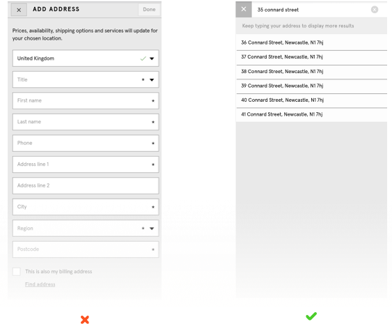
Same customer, same scarf, one minute and twenty seconds saved.
Not a lab best-case. An average across 13 luxury shoppers on iPhone X, moderated and remote. Same task, same test cards, same brief.
What shipped, and what I can (and can't) take credit for.
On causation: the checkout shipped inside a broader web-and-app programme, so the numbers below reflect it landing within that — not an isolated experiment.
The Burberry app won Best Mobile App (Glossy Awards 2017) and Best App (Drapers Digital Festival 2018) — for the app as a whole, not this project, though checkout was a load-bearing part of it.
Beyond the numbers, three things I'm proud of:
Defensible screen-by-screen. Every decision had a behavioural rationale I could put on a slide. Name the effect and you can argue the change.
The billing-address block was fixed as a priority. A single blocked user drove a real change in the shipped flow — the kind of thing a quant-only programme quietly deprioritises.
The playbook was reusable. The same eight decisions informed later flows at Burberry and other brands. Systems outlive projects.
What I'd do differently.
1. I'd tie every design decision to a psychology principle from Day 1.
I wrote the psychology up after making the decisions — backwards. Now I lead with the behavioural frame and let it drive the sketch. Design that starts with a named effect is already halfway defended.
2. I'd design the measurement rig before shipping, not after.
Everything shipped as one bundle, so I can't tell you which decision owns which slice of the +3%. Now I sequence the ship with per-change A/B tests. A bundle that lifts numbers is nice; knowing which part lifted them is repeatable.
3. I'd argue harder for a luxury-specific research recruit.
Thirteen luxury owners was a strong recruit — but it was thirteen. For a funnel with this much revenue on it, I'd run a larger, segmented study (gifters vs. self-buyers, international vs. domestic). More weight in the boardroom, fewer hedges.
4. I'd write about luxury friction as a category, not a checkout.
The real insight isn't about checkout or Burberry: friction has different weight at different price points. Luxury needs its own friction budget — the drag the promise can carry before it erodes brand value, not just conversion. A framework I've taken to other clients since.
“In a supermarket app, cognitive load costs you the sale. On Burberry.com, cognitive load costs you the sale — and the story the customer will tell about the brand for the next week.”
— Personal note, post-projectBurberry is the project I return to whenever I'm about to accept that a checkout just is the way it is. Friction is never neutral — the price tag depends on what the customer thought they were buying.
Staring at a checkout, an onboarding flow, or anywhere your product promise and friction curve are in tension? My inbox is open.

Venice Architecture Biennale