Thrive
Spaces
Sales sold it. Product had six weeks. The brief was wrong.
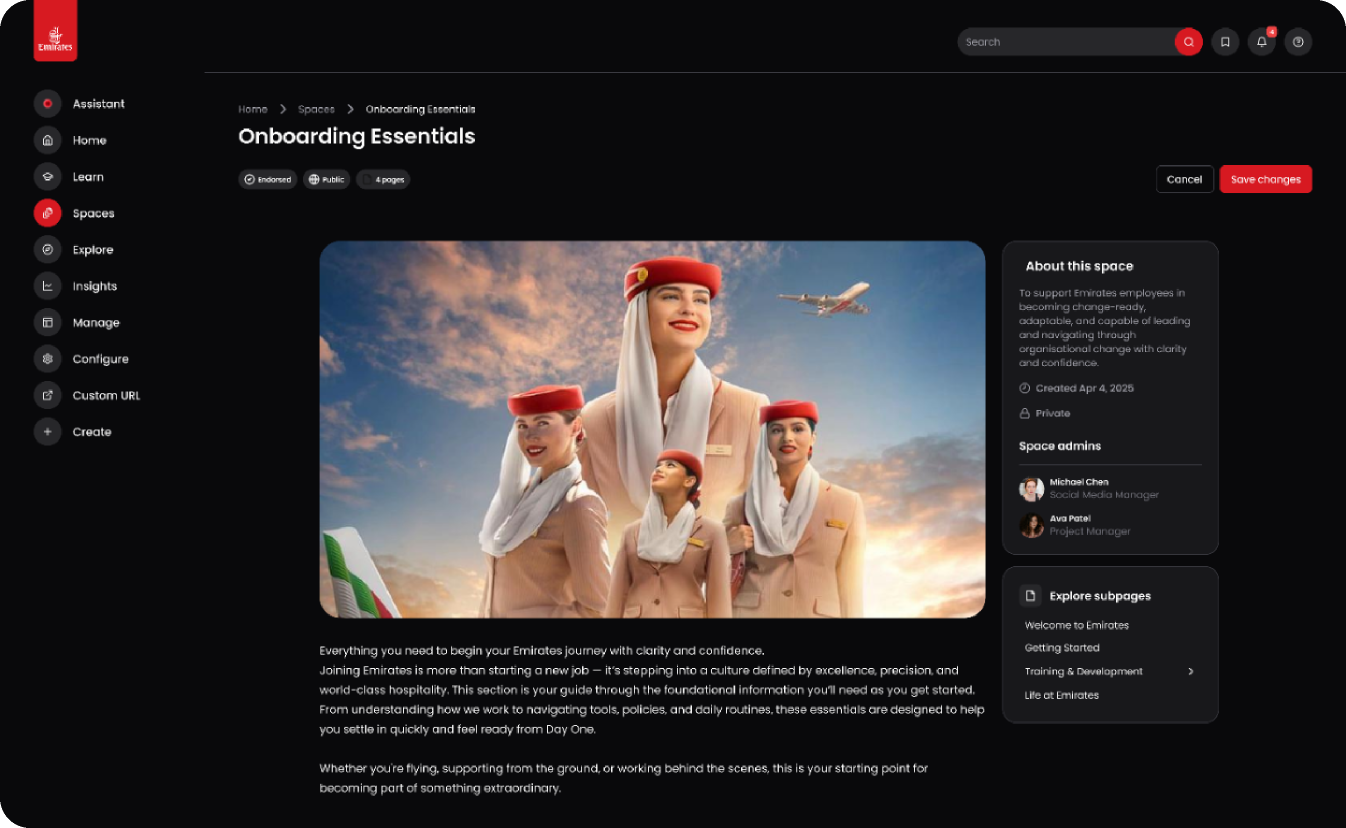
Thrive Learning is a Series-A B2B platform for enterprise L&D — Google, Emirates, Vodafone, British Airways, Tesco. Sales had already pre-sold a new Spaces product to those clients as an engagement feature. I couldn't find a PRD, a researcher, or a dedicated PM. What I could find, once I started talking to admins, was a governance problem hiding under the engagement label — and a very quiet reason our best customers might churn.
Six weeks. No PRD. One shared PM. And a feature already sold.
The kick-off looked reasonable in the room. Sales had closed several enterprise accounts with Spaces attached to the deal — a community layer inside Thrive, described to buyers as the place where teams learn from each other. Product had six weeks to make it real. My job was to design it.
What I couldn't find was any of the scaffolding a designer normally leans on.
No PRD.
Spaces was being built on intuition and client pressure. No written product rationale. No explicit success criteria. No documented scope.
One PM.
Shared across every vertical in the product. Available in fifteen-minute windows, not weeks.
No researcher.
Discovery had to be self-led. Interviews, synthesis, and test moderation all on me.
Limited data.
Product analytics were sparse for the surface. Instrumentation for a social feature that didn't exist yet was, by definition, absent.
The absence of a PRD is the tell in a story like this. It means the feature has been shaped by sales conversations, not by problem definition. It means everyone on the team is chasing a different mental picture of what “good” looks like. And it means the first job — before Figma opens — is to write the picture down.
“Alignment on a goal and product statement is the most important foundation of a project. If you can't get every individual to write down what it is, everyone is chasing a different goal.”
— Note-to-self from a previous projectI could have started drawing. I've seen designers in that seat do exactly that — hit a six-week clock, sketch what the sales deck implied, ship something that matched the demo, ride the launch. It usually looks fine. It usually solves the wrong problem. In enterprise SaaS, the wrong problem quietly compounds into churn a year later, once the customer realises the feature didn't do the job.
So I did the thing I should have done on every project before this one, and started the six weeks by not designing anything.

Five admin calls. Two learner sessions. One quote that kept coming back.
I booked time with the admins on the accounts sales had just closed. L&D leads, learning ops, HR-tech operators — the people who actually held the contract and made the buy/renew decision. Five of them took a call. I ran the conversations myself; a colleague from Customer Success sat in on two.
Small sample. Let me own that up front: five admin calls and two learner sessions is enough to see a pattern, not enough to be statistically confident. I'd have loved 40. I had five. That's a real constraint of the shape of the project, and I'll come back to it in the learnings.
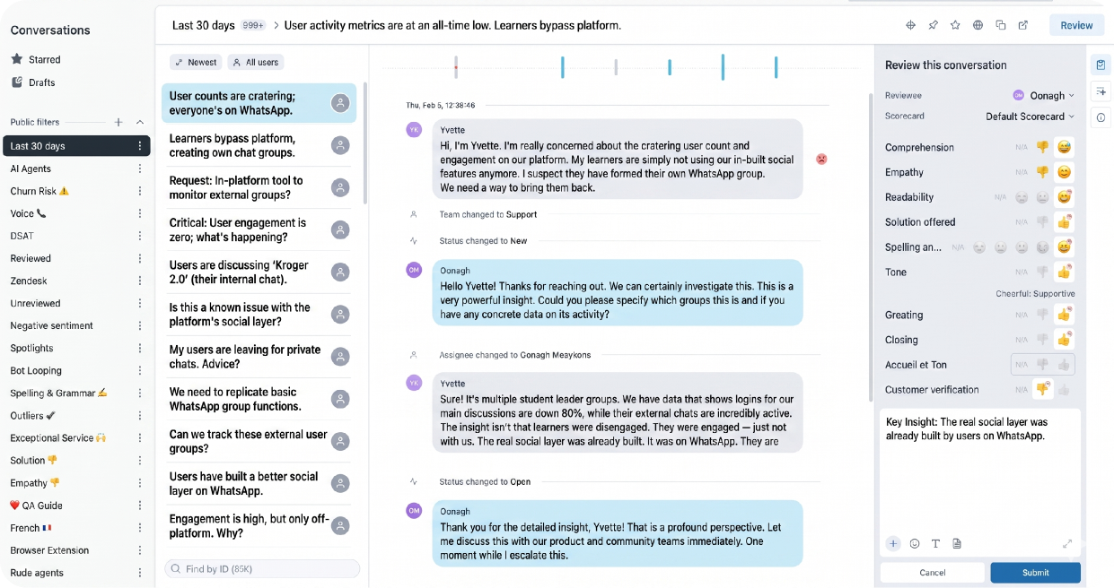
“Every WhatsApp group was a data leak, an audit failure waiting to happen — and, most importantly for a B2B business, a reason a customer could churn to a competitor who did solve it.”
— Paraphrased composite of five admin conversations, one from an L&D lead at one of our largest airline clients
Three patterns came out of the calls, and they were consistent enough across accounts that I stopped taking notes on the fifth conversation and started writing them out on the wall.
Pattern one — Learners
Employees treated Thrive as compliance admin. It was where they went to be assigned mandatory training and to be marked complete on it. It wasn't a place they wanted to be.
Pattern two — Admins
The conversations that mattered — questions, peer teaching, cross-team problem-solving — were happening on WhatsApp and Slack. Admins had zero visibility into them. No audit trail, no reporting, no leverage.
Pattern three — Content
Our user-generated content feature had no home. It was a button with no destination — an orphan feature waiting for a room to live in.
The triangulation
Pattern one made Thrive unloved. Pattern two made Thrive dangerous to keep. Pattern three meant the raw material for the fix was already in the codebase — it just didn't have anywhere to go.
Why WhatsApp always wins the fight the enterprise doesn't know it's having.
The shadow-IT pattern the admins were describing isn't a story about Thrive specifically. It's a story about human behaviour inside organisations, and it shows up in every enterprise product that isn't paying attention to it. Four effects, all pulling in the same direction, all pulling away from the sanctioned platform:
Path of Least Resistance
The tool with the lowest friction wins the conversation. Opening WhatsApp is one tap. Opening Thrive, finding the right team, posting into a threaded discussion, and tagging the right person is roughly nine. People choose paths, not platforms — and they choose the shortest one available. Every time.
Social Proof & Network Effects
Conversations gravitate to wherever everyone else already is. A WhatsApp group with 40 colleagues in it beats a “modern learning platform” with 40 colleagues who aren't watching it. Whichever surface holds presence holds the conversation. The enterprise platform doesn't lose because it's worse. It loses because it's empty.
Learned Helplessness
Once a platform is coded as “compliance,” it can't be coded as anything else. Learners who'd only ever used Thrive to click “mark complete” on mandatory training had a fixed mental model of what Thrive was for. Asking them to also use it for community was asking them to override a habit their own IT team had trained them into.
Principal–Agent Problem
Employees optimise for their day. Admins optimise for the year. A learner picks the tool that gets them home. An admin picks the tool that won't get them fired at the next audit. A well-designed enterprise product has to serve both — or the users will pick the first tool and quietly strand the admins with the second.
Once these four effects are named, the design problem stops being “make Spaces engaging” and becomes something sharper: build a surface that competes with WhatsApp on the friction curve, and gives admins the audit-and-governance layer WhatsApp will never give them. Same shipping deadline. Radically different scope.
Engagement was the label. Governance was the problem.
Spaces is an engagement feature. → Spaces is a governance surface with a community layer on top.
On paper, that swap looks like a semantic tweak. In practice it changed everything about the project.
An engagement feature is measured on time-on-platform and posts-per-week. A governance surface is measured on which conversations move off WhatsApp and into the sanctioned system — a completely different success metric, aimed at a completely different buyer.
An engagement feature is sold to L&D managers looking for a KPI to hit. A governance surface is sold to CIOs, CISOs and compliance officers who'll pay ten times the premium to avoid one audit finding. Same product, different buyer, different retention story.
An engagement feature can be a nice-to-have that gets deprioritised in the next quarter. A governance surface is a defensible reason a customer stays on your platform when a cheaper competitor calls next month.
“That reframe changed who I needed to convince. It wasn't a PM conversation anymore. It was a platform conversation.”
— Speaker notes to myself, week twoReframing a feature at week two of a six-week build is not a small ask. It means going to the CPO, the tech lead, the sales team who'd already made promises, and asking them to hold the shipping date while I re-scope the thing they'd sold. Nobody was thrilled. But every one of them recognised the pattern once I put the shadow-IT quote in front of them. The story sold itself, once I had a story to tell.
The PRD I wrote because nobody else had time to.
The scaffolding wasn't going to arrive. I could complain about that, or I could build it. So I wrote the PRD myself — framed the opportunity, sized the risk, scoped an MVP, mapped dependencies with engineering, and lined up the questions I still couldn't answer so we could all see the gaps in one place.
A few notes on how that actually worked in practice, because “I wrote the PRD” is the kind of sentence that sounds heroic and hides a lot of grubby detail:
Draft with AI, iterate with humans
I used AI to accelerate the first draft — the boilerplate structure, the risk-and-mitigation table, the dependency list. The judgement calls (which pattern to prioritise, which trade-off to accept, which stakeholder to push back on) stayed with me.
Iterate with the PM and tech lead
The shared PM had fifteen-minute windows. I brought a written draft into each one. Fifteen minutes is enough to red-line a document; it's not enough to co-author one. Writing first was the price of respecting her time.
Co-run discovery with Customer Success
No researcher meant I recruited from CS's account list. CS sat in on two calls; I took notes; we synthesised together. It's not a substitute for a research function — but it's a much better substitute than nothing.
Build the test rig on Maze
I built a remote unmoderated test in Maze so we could pressure-test the widget with a handful of learner-side users on the accounts before we shipped. Small sample, again. Enough to catch the worst of the affordance problems.
None of this is glamorous. It's the boring middle of enterprise design work — a stack of small compromises that let a project ship on time without shipping the wrong thing. What made it work wasn't any single move; it was refusing to let the absence of a PRD, a researcher or a dedicated PM become the excuse for a thin design.
Spaces, clubhouses for teams, wired for governance.
What shipped was a Space — a bounded community surface inside Thrive that admins provisioned, moderated and audited, and that learners joined to talk with each other. The on-boarding copy landed on the metaphor that had come out of the discovery calls:
“Spaces are like clubhouses for your teams. Create focused communities where the magic happens — and we'll help get the right people in the room automatically.”
— In-product copy, Space creation flow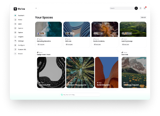
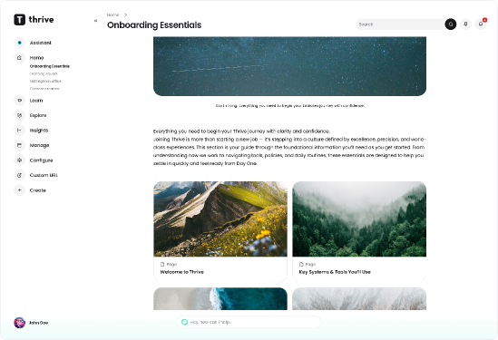
The design had to hold two audiences with different jobs at the same time — admins who needed visibility, control and audit; learners who needed the conversation to feel low-friction enough to matter. Every module we shipped had to answer to both.
What admins got
Provisioning controls, membership rules, moderation queues, content classification, audit exports. The governance layer WhatsApp will never offer — the reason a compliance officer signs the renewal. Loss aversion at the buyer level: the value of Spaces isn't in engagement gained; it's in audit findings avoided.
What learners got
A composable space with a feed, a directory, a knowledge hub, and — the thing WhatsApp actually delivers — a room where their colleagues are already present. If the room isn't already populated, learners won't come. Auto-add rules solved for that at launch. Social proof at the user level.
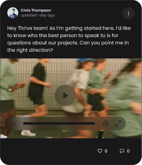
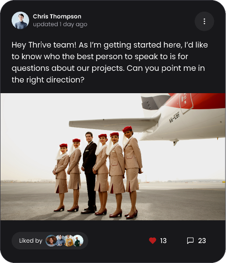
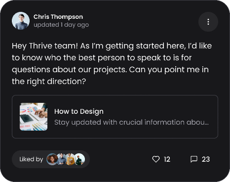
“Add a block”, the small component that carried the big idea.
The single most load-bearing component on the surface was the Add a block control — the mechanism by which a Space owner composed the room. Add a feed. Add a knowledge hub. Add a poll. Add a calendar. Add a directory of members. Each block a small governance decision (who can post, who can moderate, what content type is allowed) dressed as a creative choice.
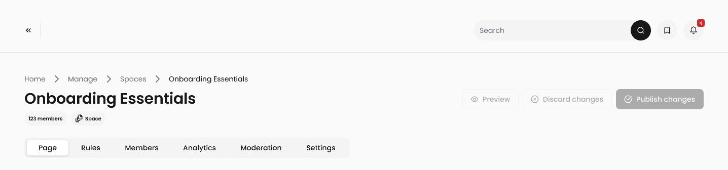
Three psychological effects were doing quiet work inside this one component, and I want to name them because they explain why it earned the time it did:
The IKEA Effect
A Space that an admin built— chose the blocks for, arranged, named — is a Space that admin is materially more invested in than a Space that was auto-provisioned for them. Sigma's phrasing: “people tend to attach personal significance and effort to their creations, leading to increased satisfaction and attachment to the end product.” Add-a-block wasn't a config flow. It was a creation ritual, and it was designed to feel like one.
The Endowed Progress Effect
Every new Space arrived with two blocks already in place — a welcome feed and a members directory. Admins didn't build from zero. They built from two-of-eight, which (per Nunes & Drèze's original loyalty-card work) is dramatically more motivating than the same journey framed as zero-of-six. Getting to a populated Space felt easy because the first two steps had already been taken for them.
Recognition over Recall
The block library used icons, one-line descriptions, and previews — never plain text lists — because admins configuring their first Space had no mental model of what a “knowledge hub block” was until they saw one. Show, don't ask them to remember.
“People tend to attach personal significance and effort to their creations, leading to increased satisfaction and attachment to the end product.”
— IKEA Effect · Sigma UX HandbookAdd-a-block is the component I'd point a candidate at if they asked me what “designing for behaviour” actually looks like at the pixel level. It's tiny. It's boring on first look. It's carrying three separate behavioural effects on its back — and it's the reason admins built their Spaces in the first week instead of parking the project.
What shipped, and what I can (and can't) claim.
Let me be careful here, because the honest impact of this project is directional, not statistical. Three things I can point to; a few things I can't.
What I can't claim: a validated retention lift, a measured governance impact, or a change in the customer's audit posture. I'd have loved to instrument all three at launch. We didn't, because the six-week clock and absence of an analytics owner ate the measurement plan. That's on me — I'll come back to it in the learnings.
What I can claim: the reframe held. It survived contact with the sales team, the tech lead, and the customers. Spaces shipped as a governance surface with a community layer on top — not the reverse — and that framing is what the sales team now leads with in prospect conversations.
What I'd do differently.
1. I'd write the business case before I drew the first screen.
Every project I'd worked on before this one, I'd started in Figma. Even the projects where I “did research first” — the research had usually been to inform the design, not to define the problem. Spaces was the first project where I started with a written business case: a one-page problem statement, a risk frame, and a “who does this actually serve?” section. That single change — writing before drawing — is the meta-lesson of the project.
“The work I'm most proud of isn't the widget. It's that I learned to write the business case before I drew the first screen.”
— Personal note, post-launch2. I'd fight for measurement at kick-off, not at ship.
The reason my impact section is directional and not numerical is that we didn't define what “success” looked like as a measurable event until we were three weeks in — by which point instrumentation was a nice-to-have that slid off the scope. On the next project, “what will we measure at day 30, 60 and 90?” is a Week One question, not a Week Six one. Every hour spent on measurement design at the start pays back tenfold at review.
3. I'd own my sample size out loud, earlier.
Five admin calls and two learner sessions is a small sample. In every stakeholder conversation I had, I felt the temptation to hedge that number, to describe the research as if it were a bigger study than it was. The right move — the one I now default to — is to name the sample out loud, note what it can and can't tell you, and be honest about which findings are directional patterns versus validated insights. Confidence isn't about the size of your evidence. It's about the accuracy of how you describe it.
4. I'd bring the CIO/CISO buyer into the room earlier.
We designed the governance layer with admins in the loop, and it landed. But the actual buyer of a governance feature — the CIO, the CISO, the compliance officer — never sat in a single discovery call. If they had, I suspect the governance framing would have been sharper still, and the sales team would have had an even cleaner story to lead with. On the next enterprise project I lead, the buyer is in the discovery cohort, not just the sell cohort.
5. “Without permission” is a heading. Not a strategy.
I described the project internally as one I'd led “without permission.” That reads well in a portfolio deck. In practice, it's shorthand for a specific behaviour: seeing a gap, testing your hypothesis quickly with the people most affected, and coming back with a written case rather than an opinion. That pattern has a shelf life; when it works, it earns you the next project's PRD before you have to write it. When it fails, it burns political capital fast. Knowing which version of the pattern you're running is a skill I'm still calibrating.
Spaces is the project I go back to when I'm about to accept a brief at face value. It taught me that the most valuable move a designer can make in the first two weeks of a project isn't opening Figma. It's writing down the problem — clearly, honestly, with the risks in view — and testing whether the people who briefed you agree with the version on the page.
If you're staring at a six-week deadline for something that hasn't been written down yet, my inbox is open.

Burberry