Emirates
Skywards
A $3B loyalty platform was leaking its best customers. So I stopped designing a page.

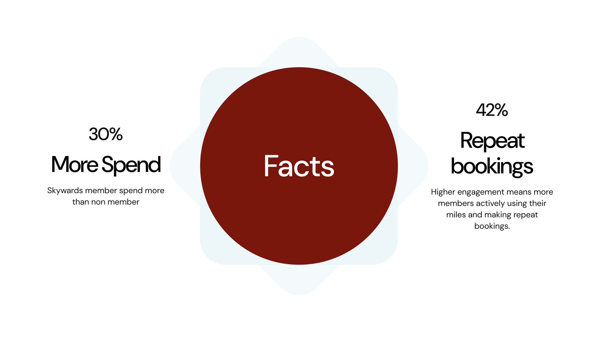
37M members who spend 30% more per trip and rebook 42% more often — and the best ones were quietly drifting into indifference. I was hired to redesign the members page. What shipped was a system that decides which page to show, to whom, when.
“Redesign the members page. Increase engagement.”
Ten words. Skywards was category-defining — 37M members, 12 partner airlines, Miles people planned lives around. But engagement was drifting: still booking, slowing quarter on quarter. With these unit economics, that mattered:
“Skywards members spend 30% more per trip than non-members. They rebook 42% more often. So even a 1% shift in retention or engagement across 37M members translates into nine figures of revenue.”
— Internal business case, month oneA nine-figure problem framed as a ten-word brief. That's the tell: when the stakes are that big and the ask that narrow, the ask is almost always wrong.
A short note on why loyalty programmes work at all.
Miles have no intrinsic value — the airline can devalue them overnight. What makes a loyalty programme workisn't the miles. It's four psychological effects Skywards had leaned on for two decades.
Investment loops
Members don't own miles — they own the effort that earned them. Every flight is a deposit; the more you invest, the more you return to protect it. The page was meant to make that loop visible.
Endowment effect
“Your miles” feel worth more than the same miles in the abstract. The pronoun “Your” and the balance rendered up top both underwrite that.
Loss aversion
“Miles expire in 47 days” hurts about 2× as much as “Earn 5,000” feels good. Every expiry warning and countdown carried more weight than any banner.
Goal-gradient effect
Members accelerate as they near a tier — someone 90% to Gold is more active than one at 30%. Tier-progress modules are load-bearing, not decorative.
What members actually do, think and feel
A business trip or family holiday — or an email offering a deal, or a nudge about miles to spend or a tier to retain.
Enough miles for a reward flight, or expiring miles to spend — or an upgrade is wanted or available.
At the airport, unsure which tier benefits are available.
An email on miles earned or tier status — and a worry that miles weren't added to the account.
- Check miles / statement
- Use the Miles Calculator
- Check tier status
- Book an upgrade
- Book a reward flight
- Check benefits at current tier
- Read email & check Skywards account
- Check miles / tier were added
- What's the best value?
- How far can my miles take me?
- How many miles can I earn?
- How many miles will this cost?
- Can I upgrade with my miles?
- What benefits do I get?
- Can I get a reward flight?
- Can I access the lounge?
- Can I get bonus miles?
- Have my miles been added?
- How many did I earn?
- Did I retain my tier?
Every good decision here was really about which of these four effects to lean on, and when. See loyalty as a stack of behavioural loops, not a set of features, and what to design — and what to strip — gets easier.
“Cycles of repeated investment, where individuals commit more resources — time, money, or effort — into a pursuit due to their previous investments.”
— Investment Loops · Sigma UX HandbookThe heatmap that killed the brief.
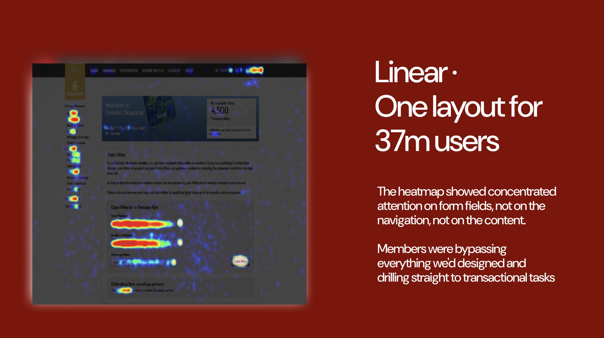
Priya, Gold tier, eight years an Emirates flyer, lands in Dubai on a red-eye. She claimed her miles mid-flight — a ritual — but the code failed, and now she's in the members section trying to fix it before her connection. Not tier benefits. Not a welcome banner. She wants to claim miles for one flight, right now.
She scrolls past six things she doesn't need, taps three that look right, and on the fourth finds the claim form — buried under “My Account.”
Priya is not the problem. The page is.
We ran heatmaps across four weeks of session data. The pattern was stark enough to change what we were designing.
Why Priya bypassed everything we designed.
The visual design was strong. The heatmap just showed four psychological effects firing at once — none favouring what we'd put on screen.
Selective Attention.She came to claim miles, so every module that wasn't the claim form was functionally invisible — her brain filtering to the task.
Information Scent.The strongest cue on the page was the “Claim Miles” field, so attention flowed there. The hero and tier carousel smelled wrong; only the form smelled like her task.
When a member's task model diverges from the designer's dashboard metaphor, the member wins. The job stops being “make the page better” and becomes “design a system that produces the right page for the right member at the right moment.”
The moments where members actually needed the programme.
First I had to know what the right moments were. I mapped the full journey — every trigger, activity and question a member asks at each step. Four stages: Onboarding → Pre-journey → In-journey → Post-journey.
Two things jumped out: the same member needs different things at different stages, and different tiers need different things at the same stage. Substantively different.
Engagement wasn't dropping because the page was broken. It dropped because the key moments — pre-booking, at the airport, after travel — were designed for a generic user who didn't exist.
Fifteen widgets, four stages, three tiers. Do the math.
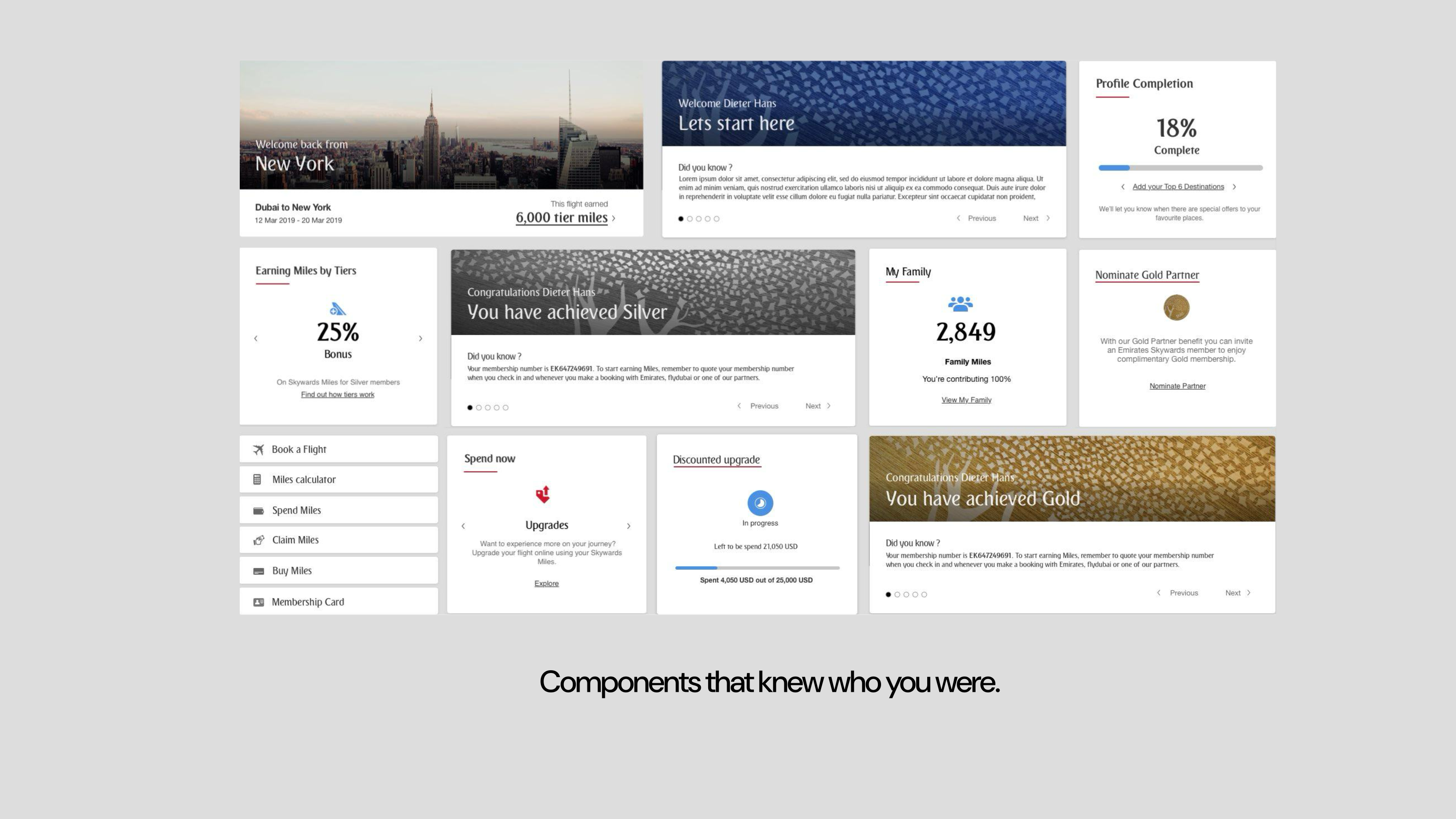
Mapped against the tiers (Blue, Silver, Gold; Platinum a v2 edge case), we counted the widgets a member might need at any moment: fifteen — Claim Miles, Book a Flight, Upcoming Trips, Tier Progress, and the rest.
Fifteen on one surface is Hick's Lawterritory. But cutting wasn't an option — a Gold member on travel day needs a different six than a Blue member at signup. Not too many widgets; the wrong ones for the wrong person at the wrong moment.
You can't design 180 pages — especially when tomorrow adds a tier, a stage, or a widget and you're back to square one. I saw it in Week 7, staring at forty layouts that all felt wrong: the difference between designing a screen and designing a system.
So I stopped designing a page. I designed a rules engine.
The pivot took an afternoon to see and three weeks to sell. What I'd hit was Tesler's Law — complexity is conserved: you can hold it in the system or inflict it on the user, never make it vanish.
The old page put it on the member — every Priya scanning past fourteen things to find one. My proposal moved it into the system. It read:
“Design will not ship 180 layouts. Design will ship a matrix of allowable widget combinations, a set of adaptive layout primitives that hold any combination gracefully, and a component library where every module knows which tier and journey stage it's rendering for. Product configures. Design owns the primitives. Engineering ships once.”
— Design proposal, month threeThree groups of people had to buy this to move it forward:
Product
Loved it — a config panel instead of a change request. “You don't file a design ticket for a Gold promotion. You toggle it.”
Engineering
Loved it less — a rules engine is harder than a page. The pitch: “Build the primitives once, never re-scope again.” The maintenance maths sold them.
Brand
Worried a system-built page would feel generic. We agreed brand signs off every layout primitive— not every permutation. That's how it scaled.
Me
Had to stop showing screens and start showing rules. Harder to pitch — nobody Instagrams a matrix — but the only way this shipped on time.
“The page was designed as a dashboard. Members were using it as a utility. That mismatch was the real insight.”
The Widget Availability Matrix.
Every cell answers one question: at this stage, for this tier, should this widget surface? Product owns the toggles; design owns the primitives that hold the result. A slice of the shipped matrix below — the real one is wider.
| Onboarding | Pre-journey | In-journey | Post-journey | |||||||||
|---|---|---|---|---|---|---|---|---|---|---|---|---|
| Blue | Silver | Gold | Blue | Silver | Gold | Blue | Silver | Gold | Blue | Silver | Gold | |
| Complete profile | ● | ● | · | · | · | · | · | · | · | · | · | · |
| Book first flight | ● | · | · | ● | · | · | · | · | · | · | · | · |
| Upcoming trips | · | · | · | ● | ● | ● | ● | ● | ● | · | · | · |
| Airport info | · | · | · | · | · | · | ● | ● | ● | · | · | · |
| Lounge access | · | · | · | · | · | ● | · | · | ● | · | · | · |
| Claim miles | · | · | · | · | · | · | · | · | · | ● | ● | ● |
| Redeem miles | · | · | · | ● | ● | ● | · | · | · | ● | ● | ● |
| Tier progress | · | ● | ● | · | ● | ● | · | ● | ● | · | ● | ● |
Six layout primitives that hold any widget combination gracefully.
Knowing which widgets surface is half the system. The other half is how they render — at one, three, six, or the rare eight. So I built six layout primitives, each tuned to a widget count and priority, and made every matrix cell resolve to one.
“Each cell of the tier × journey matrix resolves to one of these layouts, based on widget count and priority. Product teams configure; design owns the layout primitives.”
— Layout specification, November 2019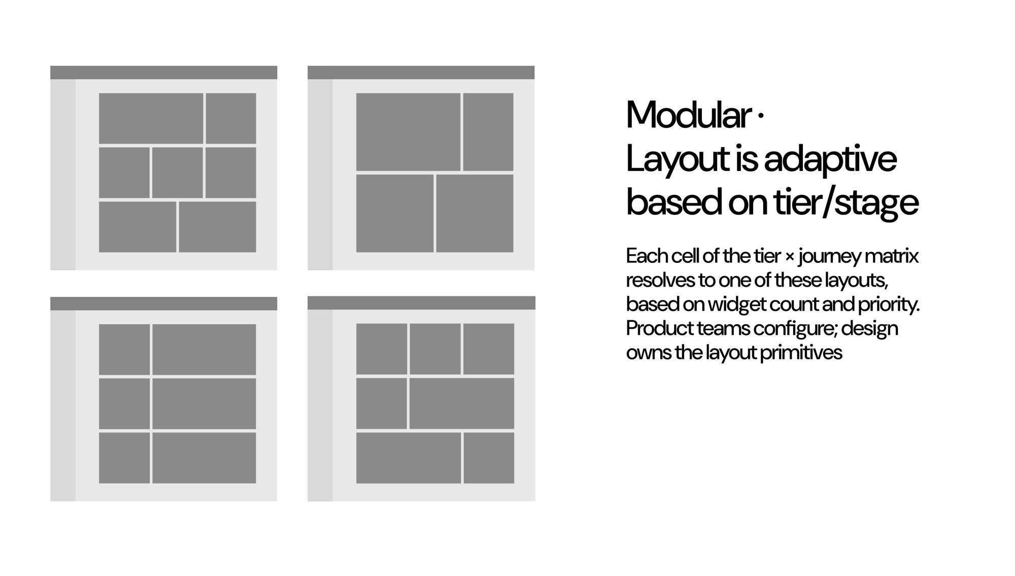
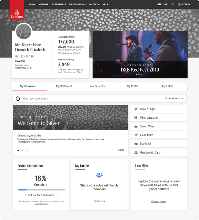
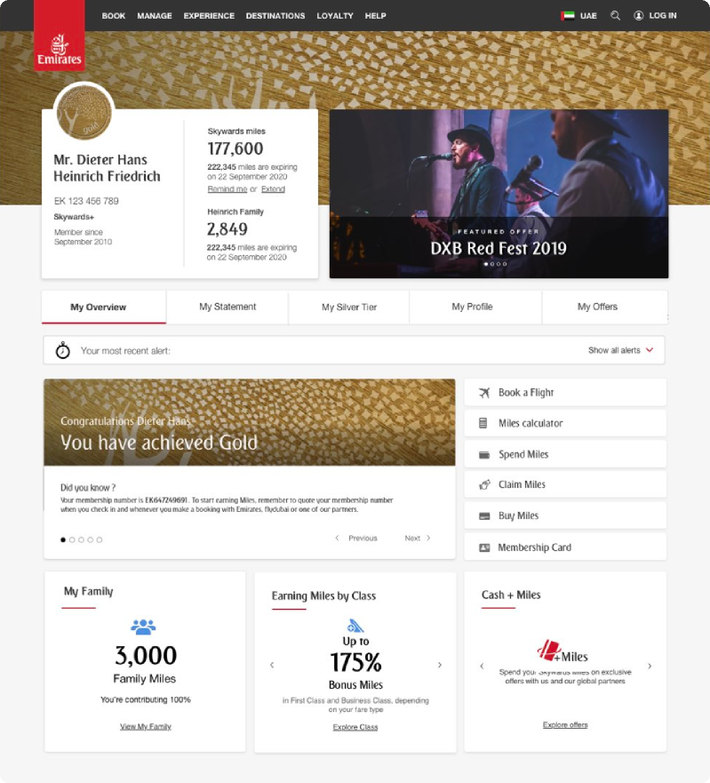
One Welcome module, four faces: city-of-origin for returning members, a first-flight CTA for Blue, an upgrade-nudge for Gold. One component, zero extra design tickets — the shorthand for how the whole system worked.
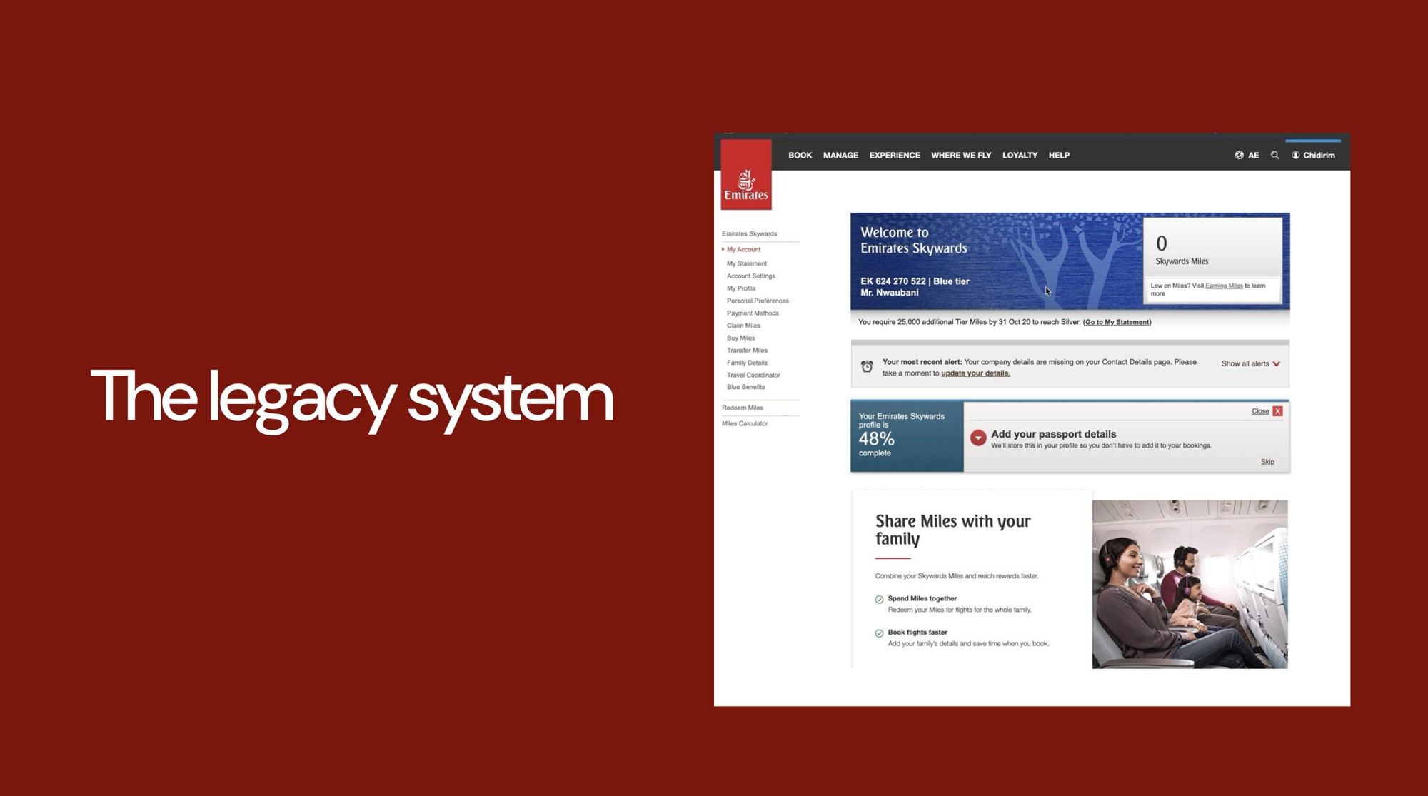
What the legacy page looked like. What it became.
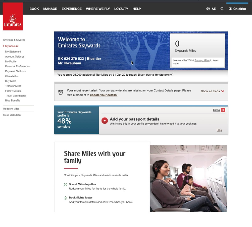
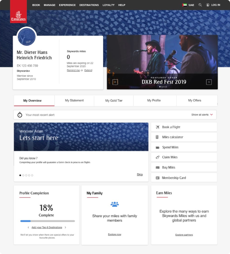
Before — the audit
Too many nav options, everything at a zero state, “My Account” (where you book and redeem) hidden, five viewports of components, no clear booking CTA.
After — the new surface
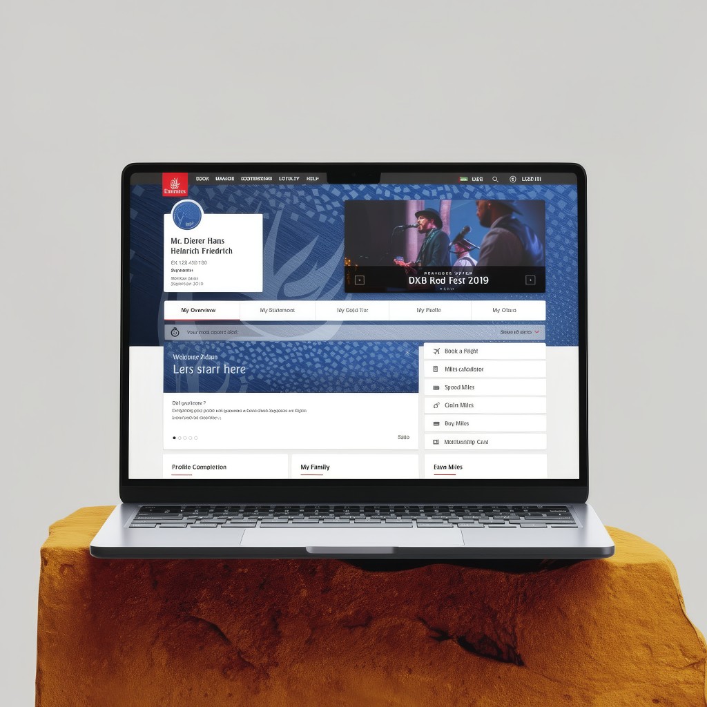
Same member, same stage. A page assembled at request-time from relevant widgets, ordered by priority, styled by tier. A utility that knew what she came for.
How we knew we weren't guessing.
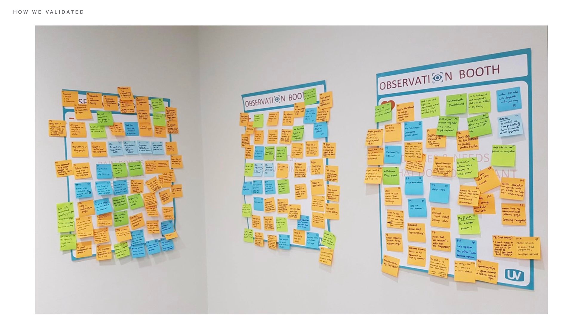
A framework this ambitious needed proof. We ran five research methods across the design phase — some to inform, some to test, some to keep us honest.
The card sort was the most useful. Forty-two members sorted the fifteen widgets by “how often would I reach for this?” — not “how much do I like it?” Claim Miles and Redeem Miles, buried three levels deep, were what members reached for most. We reversed the IA in a week.
“Many users, even the higher tiers, found it difficult to find where to spend, claim and buy miles — which is a key revenue driver for the business.”
— Research finding, quantitative + qualitative
What shipped, and what I can't take credit for.
Honesty first: launch slipped from 2022 (pandemic, restructuring) and I'd left before it went live — so I don't have the post-launch numbers a perfect case study puts up top. Here's what I can point to:
The work I'm proudest of isn't a number — it's that the framework outlasted me. The Skywards team was still configuring the surface through the matrix three years on. That's the bar for a system: it survives its designer.

What I'd do differently.
1. I'd push back on the brief in week one, not week seven.
The right brief wasn't “redesign the members page” but “design a system that decides which page to show” — and I found that out after seven weeks of pages that would never ship. Now week one is research only: better to burn a week on the right question than a quarter on the wrong one.
2. I should have designed the measurement plan on Day 1.
I can't quote the uplift — partly because I left, partly because we hadn't built the measurement rig up front. A framework with 180 configs needs a measurement layer as deliberate as the design. On my next system-scale project, it was in the brief on Day 1.
3. Every design decision was already a psychology decision.
The whole project was applied behavioural science dressed as a UI redesign. Now, before Figma, I write the behavioural map — which effect I'm leaning on, which tax I'm removing. “Because it's cleaner” loses to a stubborn stakeholder; “because Loss Aversion outweighs the gain frame ~2× here” ships.
“The work I'm most proud of isn't a number. It's that the framework outlasted me on the project.”
— Personal note, on leaving EmiratesEmirates Skywards is the project I return to whenever I'm about to design a page and catch myself. It taught me the difference between shipping a screen and shipping a system — and that the hardest part of a system isn't the design. It's the argument for it.
Working through the same reframe on your platform? My inbox is open.