Flipside
Crypto
A brand refresh doesn't fix a broken funnel. So I ran both, at the same time.
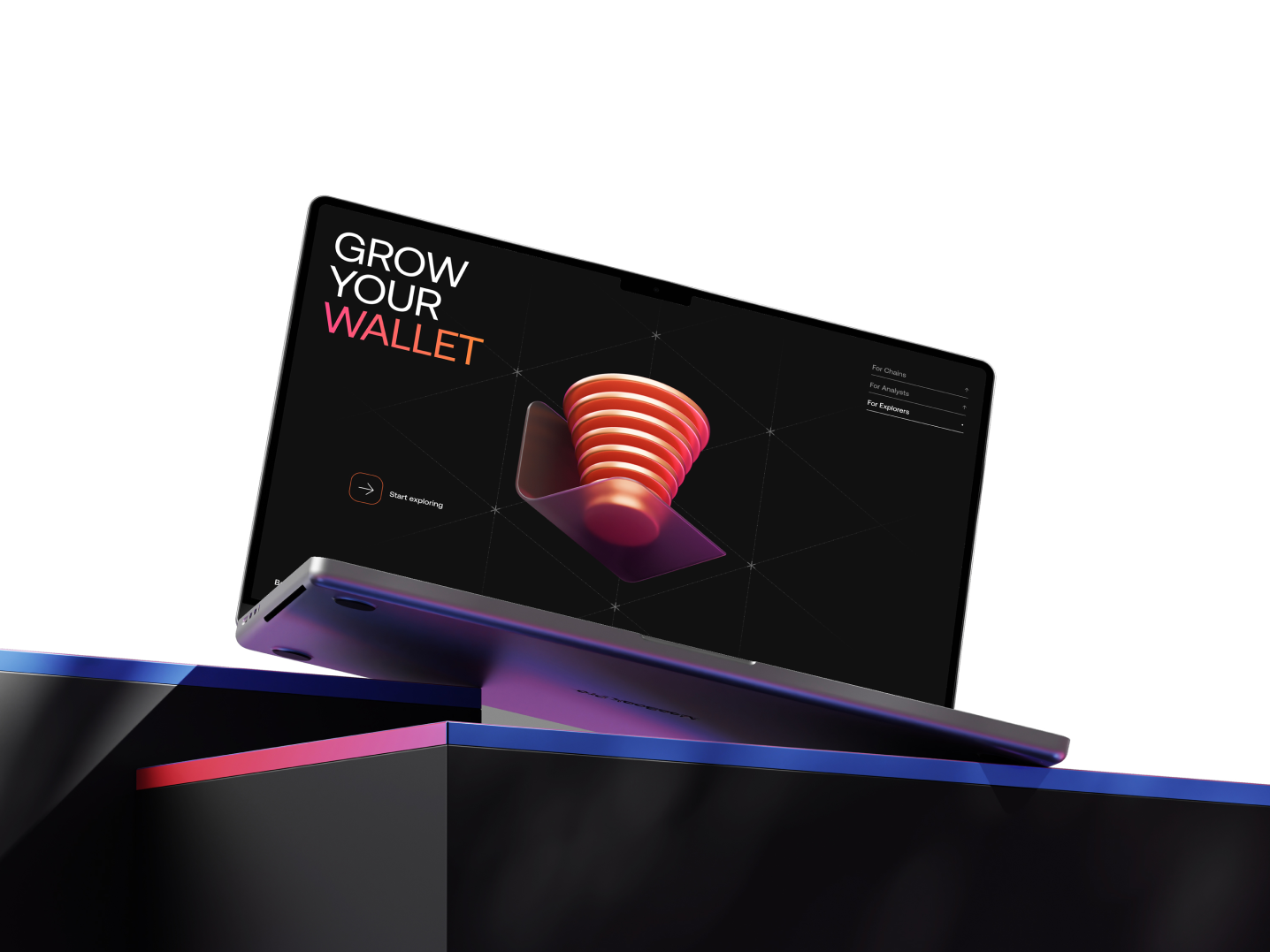
Twelve thousand users started a quest on Flipside's Earn platform. 414 claimed the reward. A brand refresh was already underway; the product wasn't. I joined as sole designer and ran the UX rebuild against the live brand redesign, building both so you can't tell where one ends and the other begins.
The number that named the project.
On paper, Flipside was thriving: 100+ employees, $80M in funding, 10,000+ monthly users, chain partnerships with Solana, Optimism, Aptos and more. Its Earn platform, on-chain “Quests” and “Grail” tournaments for real crypto, had already paid out $1.23M to 212,000+ people. So why did the funnel look like this?
| Step | Count |
|---|---|
| Started a quest | 12,000 |
| Reached the completion step | 10,400 |
| Clicked “Next step” | 3,200 |
| Claimed the reward | 414 |
| End-to-end completion rate | 3.45% |
96.5% of people who chose to start a quest, opted in, connected a wallet, arrived on purpose, left without what they came for. A brand refresh wasn't going to fix that. It was also, quietly, why the refresh got commissioned: “growth is stalling” is often “our product doesn't deliver what our brand promises,” dressed for a leadership meeting.
“With no designer, this was a challenge Flipside had been struggling with. It was my job to put design and the user needs at the centre of this rebuild.”
Contract framing, week oneFour months, one designer, a brand refresh already in flight. The biggest constraint wasn't scope; it was synchronisation: every brand decision, the product had to catch up; every product problem, the brand team had to hear. This is the story of running both tracks as one.
Eight weeks. Five phases. Brand and product on the same clock.
- Week 1–2: Immersion & audit
- Week 2–4: Branding & art direction
- Week 3–5: UX direction & wireframes
- Week 5–7: Design production
- Week 7–8: Development handover
Two fixed dates bracketed everything. Permissionless, the 27 September conference where the new brand would première. Site launch, mid-October, when brand and rebuilt product went live together. Everything else was a variable I could push against.
The audit that renamed the problem.
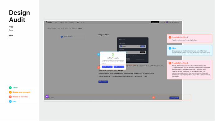
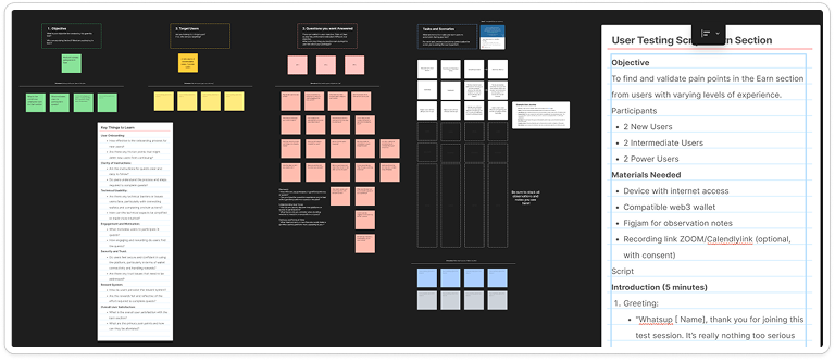
Before proposing anything, I did two things: audited every Earn surface against a four-tag system (Good · Needs work · Broken · Idea), and interviewed users the team trusted, heavy questers and drop-offs alike. Their exact words did more than any dashboard.
Aaron · Active quester
“What does 'per user' mean? That's confusing. What is the alternative?” On the reward-per-user language on the Earn page.
Sarah · First-time visitor
“Not sure what to do. I see I need to connect my wallet, that's probably the first thing I'd do.” Read the interface backwards. Bypassed the header entirely.
Aston · Lapsed quester
“The rewards currently are all less than five dollars. That's why I don't feel, that's why I don't go chase down the rewards.” The economic frame the site didn't set.
Aston · Same session
“Usually I would come in from Twitter, so the discovery part and the homepage wasn't really a necessary step.” The single insight that reshaped the information architecture.
Anton hit the platform's worst bug mid-session: clicking “Complete Quest” redirected him instead of validating the transaction. In product terms: the completion step is a dead end, and users feel it before it shows up in the funnel.
One pattern ran under all of it: every label, “per user rewards,” “next step,” “complete quest,” was written by people who lived inside the product. Aaron didn't know what “per user” meant; Sarah never read the header. So the audit's first output wasn't a design change; it was a glossary of internal jargon that had leaked into the interface, rewritten for someone who arrived from a Twitter link with thirty seconds of patience. I grouped every quote and friction point on one board. The readout, in a line:
“The platform is failing on many levels, starting with onboarding. From a UX perspective there are major issues with hierarchy and consistency creating a disjointed experience. We lack the golden handholding experience to guide users through their journey. We don't provide feedback for those who complete their journey. And much of our messaging is unclear and difficult to understand.”
Research readout, week two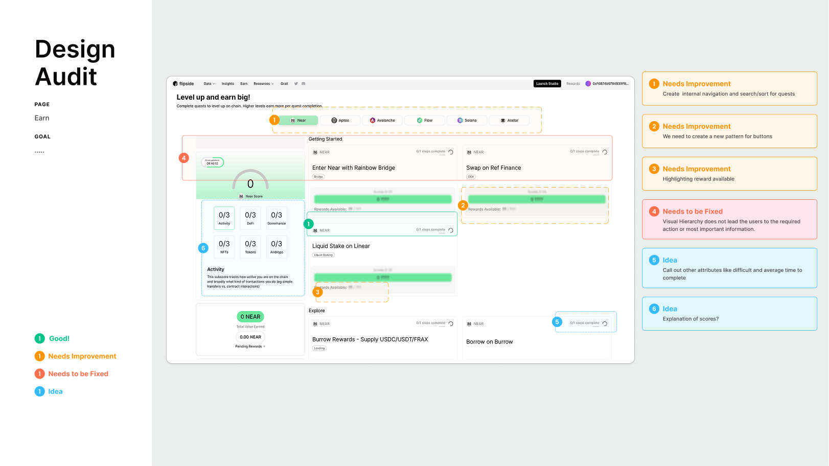
“No defined journey” → “Redefined journey.”
Read back-to-back, the diagnosis wasn't usability; it was orientation. Users didn't struggle to click; they struggled to work out which button was for them, at which step, for what reward, on which chain. We were spending their whole attention budget deciphering the interface before they'd even started the quest.
So the brief changed. Not “redesign the site” but design a defined path from Twitter click to reward claimed, and make everything else serve that path. Not a homepage. A funnel.
“Sometimes delight is the things we don't have to think about.”
The design principle that ended up on every review deckGetting the leadership team into the room in week two.
Alongside the audit, I ran a two-hour branding workshop with Flipside's leadership, the people whose gut reactions would make or break the project. Four exercises. Everyone spoke; everything went on the wall.
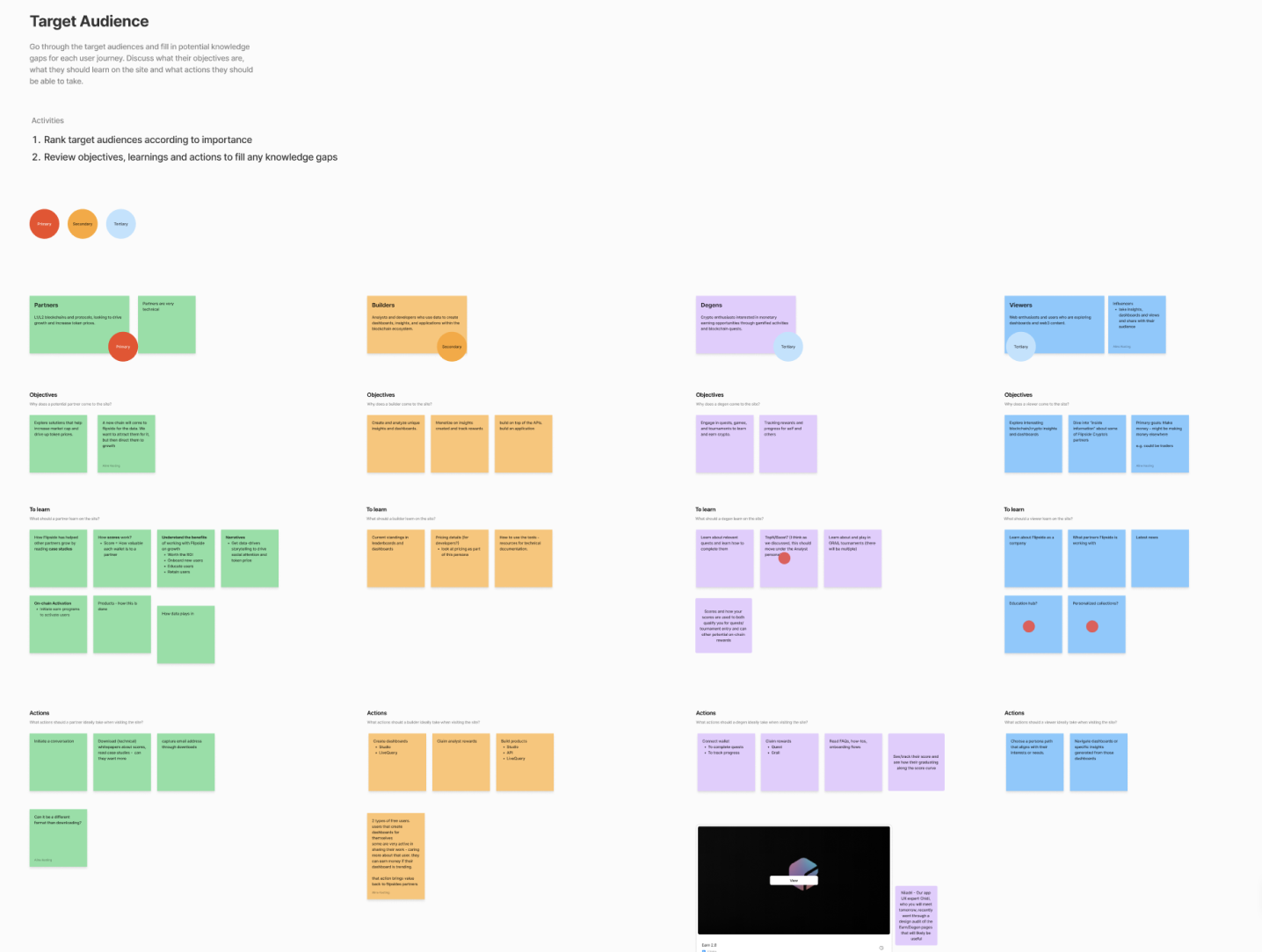
Bringing them in this early wasn't about consensus; it was about anchoring. If their first exposure to the redesign is a finished Figma mockup, every objection reads as rejection. If it's a wall of their own post-its, every later decision traces back to something they said.
Six moodboards went up, tagged by personality. Two won consensus: Graphical · Minimal · Mature and Immersive · Techy · Vibrant. The line that became the brief-inside-the-brief came from Kyle Fugere: “Being different for being different isn't important; there's a reason it works.” Lead with a reason, not a look.
Three brand directions. One had to survive contact with the product.
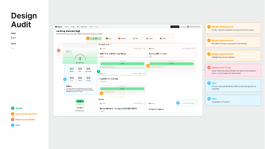
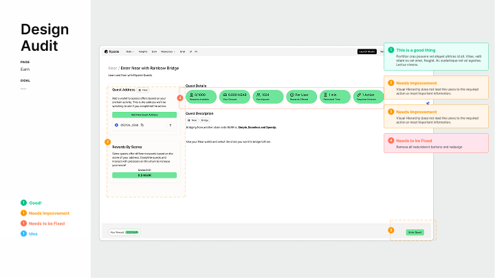
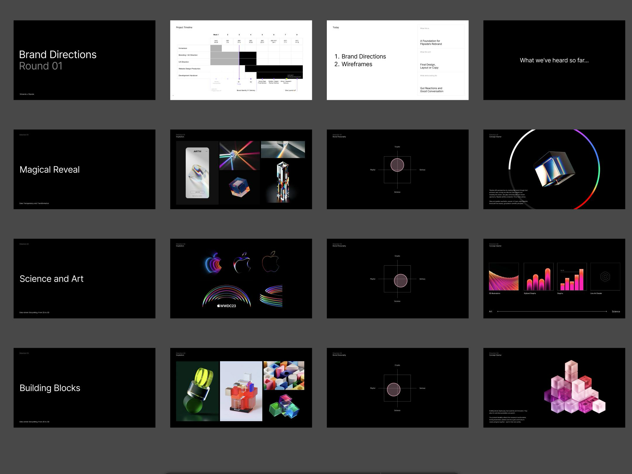
Round 01 set the frame up front: gut reactions and good conversation, not final design, layout or copy.
Direction 01 · Magical Reveal
Data Transparency & Transformation. Glass and prisms. Flipside as the lens that refracts data into insight. Aligns with the popular crypto aesthetic of glassmorphism. Parked.
Direction 02 · Science & Art
Data-driven Storytelling · 2D → 3D. Data-visualisation as art. Rainbow gradient lines, WWDC-adjacent. Beautiful. Also universally beautiful: every data brand looks like this now. Parked.
Direction 03 · Building Blocks · Shipped
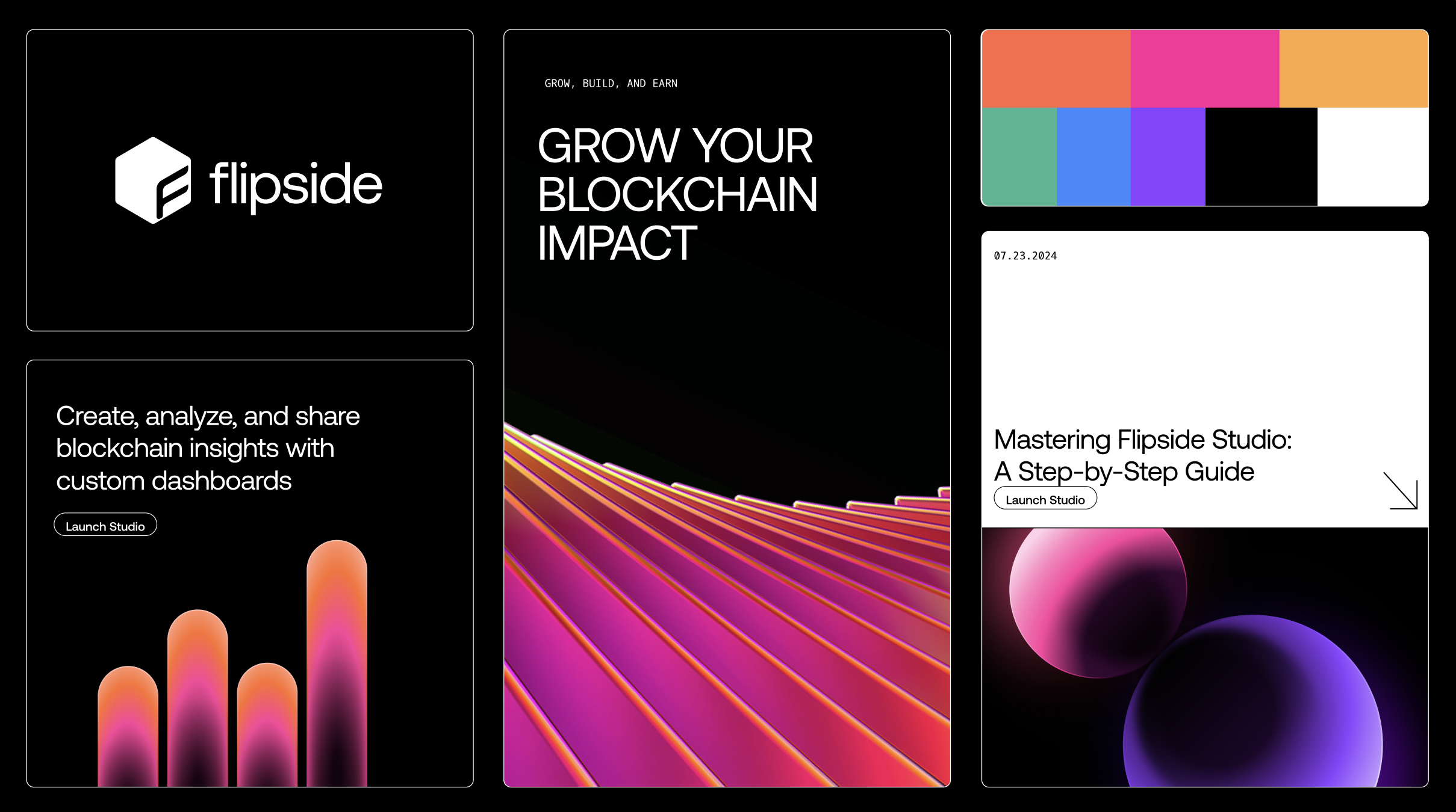
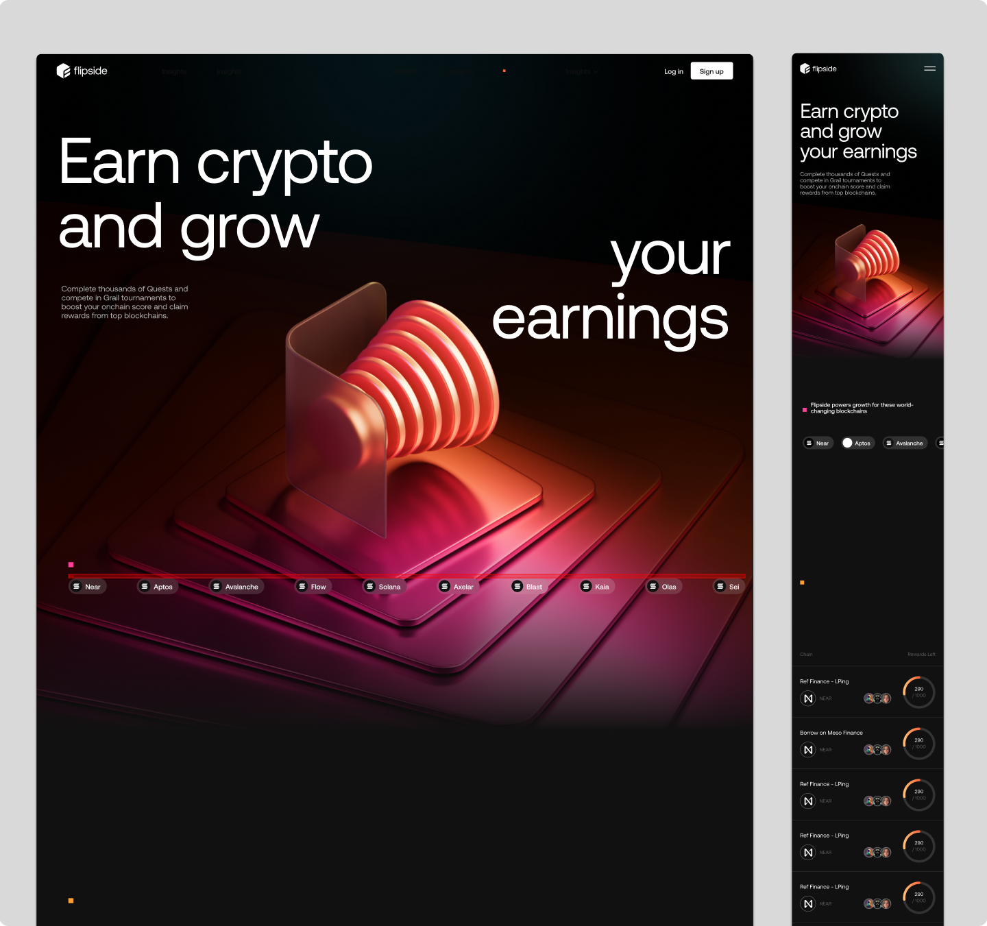
Composable · Crypto-native · Owned. A hexagonal “F” cube constructed on a 30° isometric grid. Building blocks as the mental model: blockchains, builders, and the crypto community assembling their own worlds inside Flipside's system. Shipped.
Turning empathy into action.
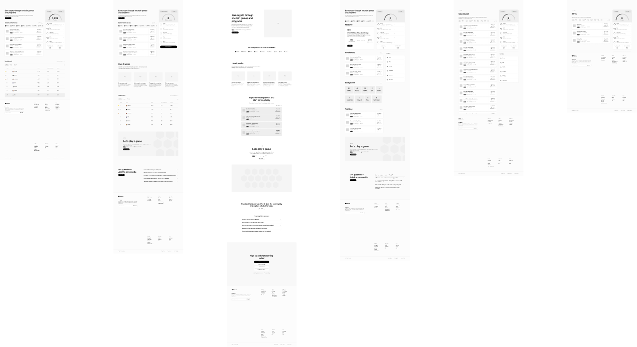
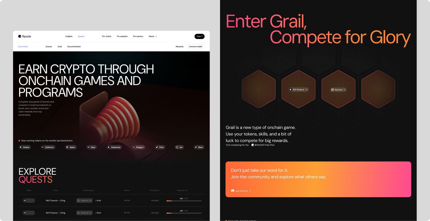
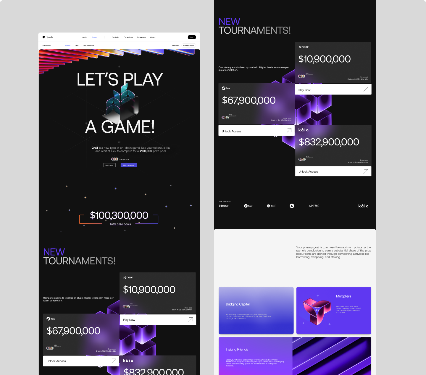
With the brand locked and the audit in hand, I could design against a concrete brief: a defined path from Twitter click to reward claimed. The sharpest move was the simplest: cut the navigation from eleven top-level items to three: “For chains,” “For analysts,” “For earners,” the three audiences Flipside monetises. Fewer choices, faster decisions.
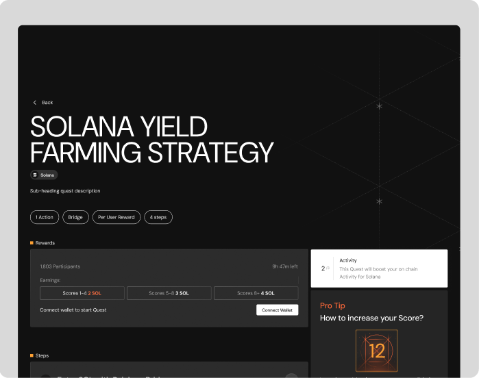
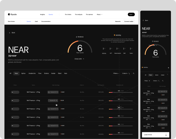
Everything else served that path. Quest cards now lead with the reward and reveal the mechanics only on tap; a visible three-step bar (connect → complete → claim) carries momentum; and the flow spends its polish on the two moments members remember: the reward hitting the wallet, and the “you earned $X” screen that names the chain and the next step.
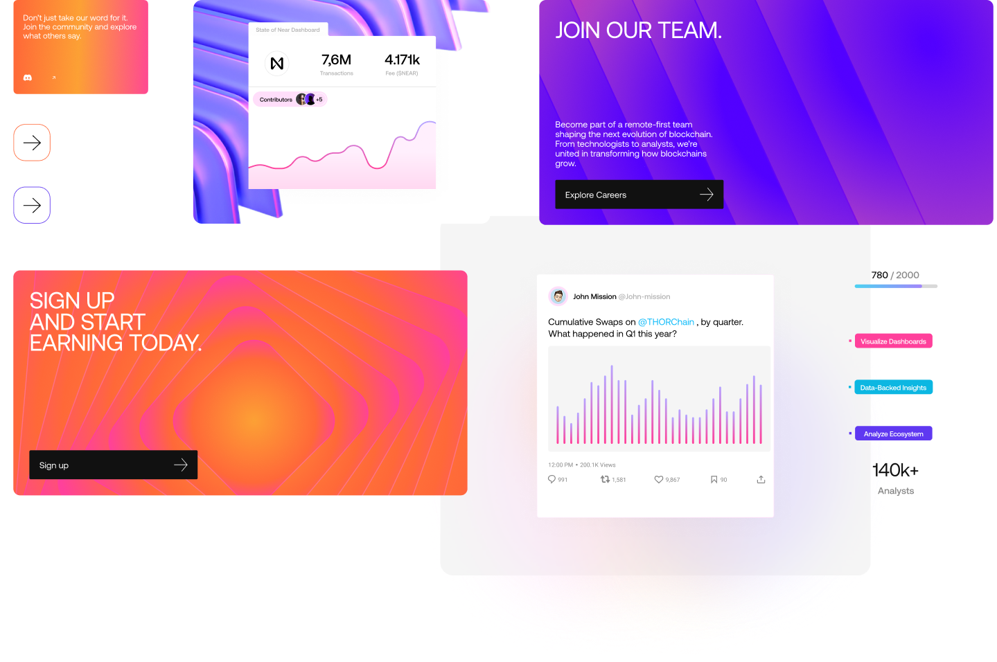
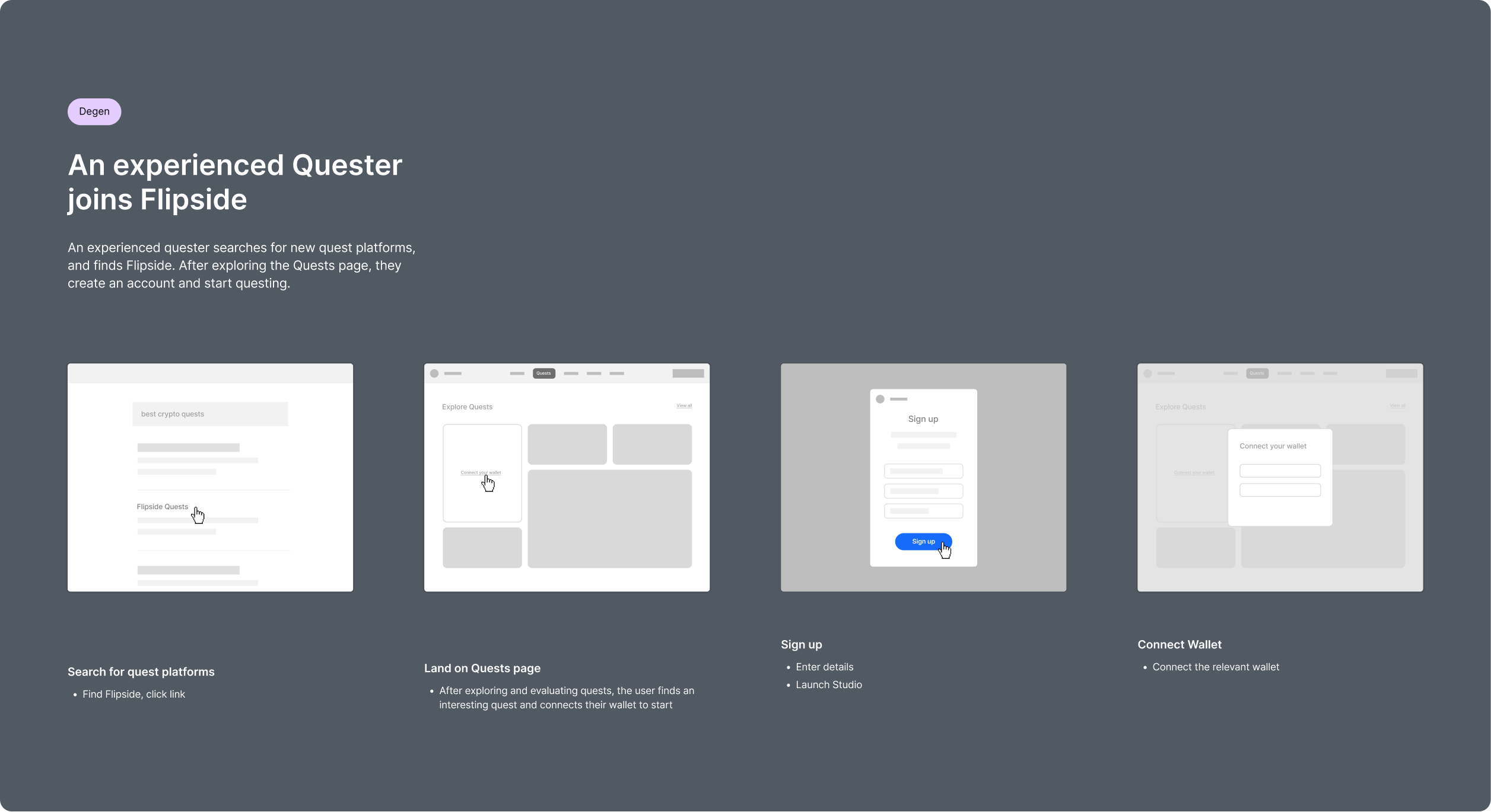
The end-to-end journey we designed against
The redesign was measured against one journey: the one an experienced quester would actually take:
Step 1: Find Flipside
Click a link on Twitter. Land on a quest page (not the homepage). See the reward first, the mechanic second. If the wallet's already connected, step one is done.
Step 2: Understand the ask
One paragraph, one image, one list of steps. No jargon that assumes the reader knows what Flipside is. Sarah's “not sure what to do” becomes “here's what to do.”
Step 3: Do the thing
The on-chain action itself: sign, swap, stake, bridge. Progress bar always visible. Wallet state always visible. The interface stays out of the way.
Step 4: Claim
One button. One confirmation. One transaction hash. If the claim fails, the error message reads like a human wrote it. No dead-end redirects.
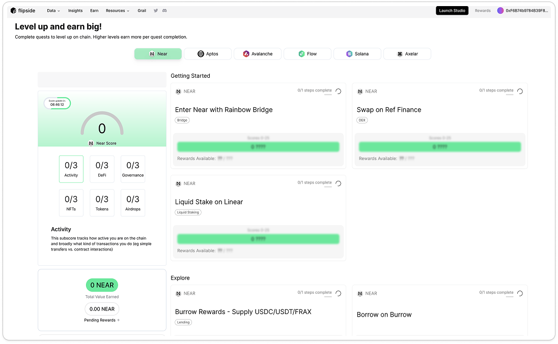
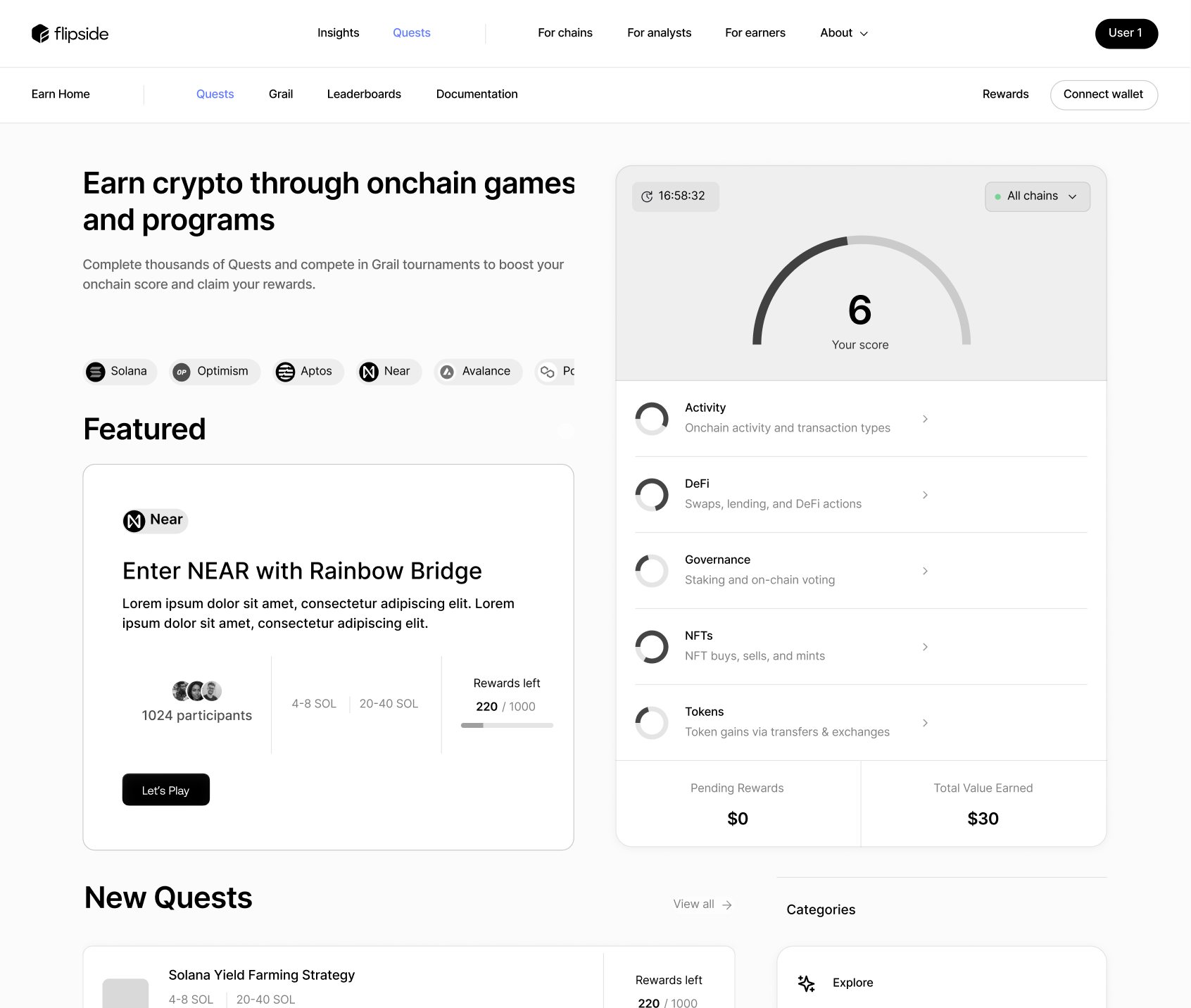
Simplifying isn't free. Tesler's Law made me argue for what I kept.
A UX Lead's real job isn't cutting; it's knowing which complexity to keep (Tesler's Law: simplify too much and you shove complexity onto the user). Two things I deliberately didn't simplify: the unmasked wallet-address field power users needed to see, and the visible completion validation with a transaction hash, because users didn't trust a claim until they saw the hash. Removing either would have moved complexity into the user's head, not out of it.
The details that took the longest.
Three details a senior review would ask about.
Wallet state as the primary anchor
Every screen now behaves by wallet state, not as a header flag, but as the primary anchor for what the page shows. Connected → “here's your progress.” Disconnected → “here's the quest, and one connect button.” The connect button itself uses the exact pattern users know from MetaMask and Rainbow. Novelty at the moment of highest stress is a bad trade.
Mono type for anything on-chain
Every address, hash, block number and reward uses the mono face. Misreading a hash is a category error, not a typography preference. That took a long conversation with the brand team, who wanted the display face everywhere. Consistency isn't the goal; legibility of the right thing is.
The empty state as first impression
Users often arrive from Twitter with no memory of the site, so the empty state, no wallet, no history, is the one I designed hardest. If it doesn't earn the wallet connect in ten seconds, nothing downstream matters.
What shipped, and what I can honestly claim.
Two calibrations first. This was a four-month contract that ended at handover, so I don't have post-launch retention data. And the funnel numbers above are pre-launch. I won't quote completion rates I can't stand up. Here's what I can point to.
Two outcomes worth naming that aren't in the numbers.
Brand and product shipped as one thing. The site that launched used Building Blocks end-to-end: the same isometric geometry through the logomark, marketing pages, quest cards, empty states and confirmation screen. No visible seam between marketing and product. That only happens if you run the two tracks together.
“Getting stakeholders in at this earlier stage really helped me get buy-in on the future design changes.”
Reflection, month threeThe framework moved with me. The workshop format, the four-tag audit, and “a psychology principle behind every non-trivial decision” became the template I've used since. A design lasts when it argues from principles the next team can inherit.
What I got wrong, and what I'd repeat.
I wrote the design principles too late.
“Sometimes delight is the things we don't have to think about” now tops every review deck, but I only wrote it in month two, after arguing decisions case-by-case for weeks. Writing it on Day 5 would have saved a fortnight of re-litigating. A UX Lead's most durable output isn't a screen; it's the sentence the team keeps quoting six months later.
And the clean version of this story, brief → workshop → Building Blocks wins → funnel fixed, is a lie by omission. Week three was messy: the moodboards split, I proposed a fourth direction and killed it. If a case study reads as inevitable, someone's lying.
“The platform needs to ensure that instructions are clear and actions are logically sequenced to provide a smoother user experience.”
Anton, user research session, and the sentence I put on the wall until launchFlipside is the case I return to when a project runs a brand system and a product surface at once, because they're not different jobs. They're the same job, seen from either side of the user's first ten seconds. Building something similar? My inbox is open.