Design discovery

The first part of the study was to get an idea of what the stakeholders wanted out of this redesign. Understanding from this perspective allowed me to understand the perpective and conducting sompetotive analyse with stakeholders to accuratly get a gauage of where we saw the company in the market. Gettign stakeholders in at this earlier stage really helped getting me buy in on the future design changes.
Findings
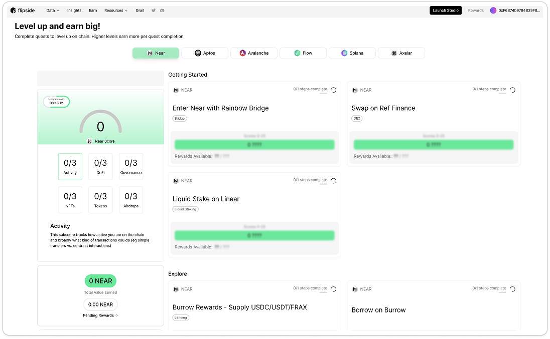
I discovered several significant issues with our user experience. Firstly, we are failing on many levels, starting with the onboarding process. From a UI perspective, there are major issues with hierarchy and consistency, creating a disjointed experience. We also lack the 'golden' handholding experience to guide users through their journey. Additionally, we don't provide feedback for those who complete their journey, and much of our messaging is unclear and difficult to understand.
Data Analytics Takeaways

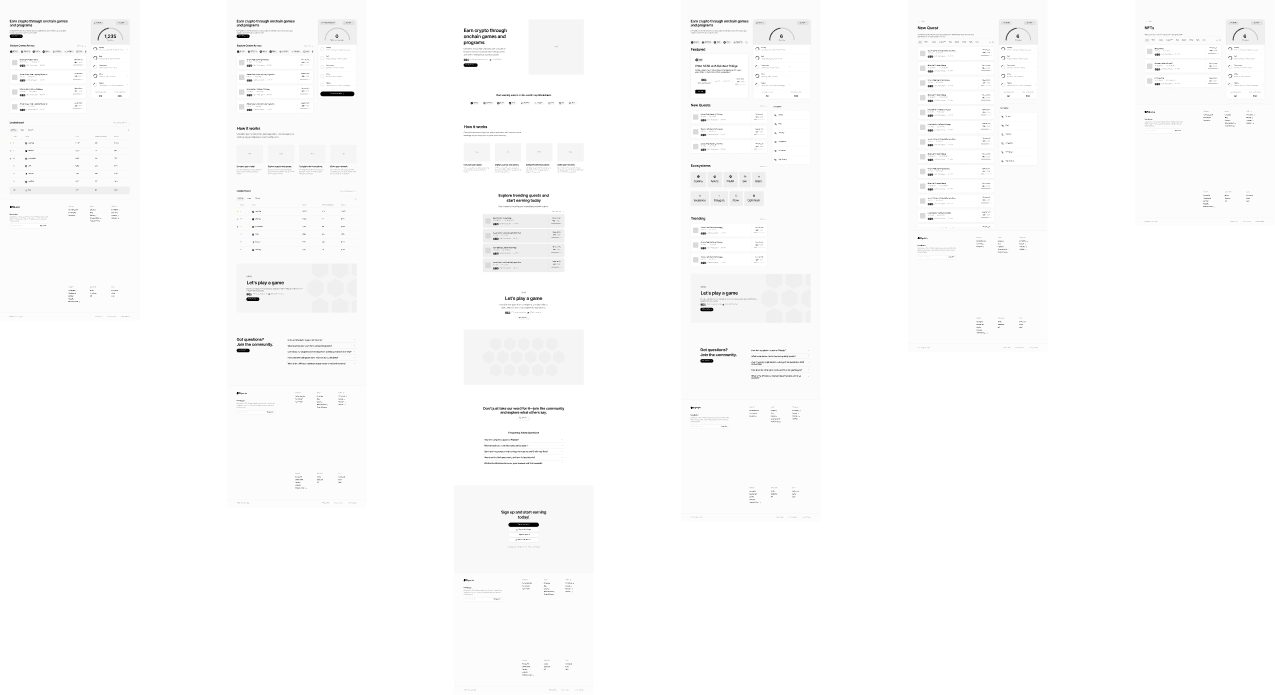
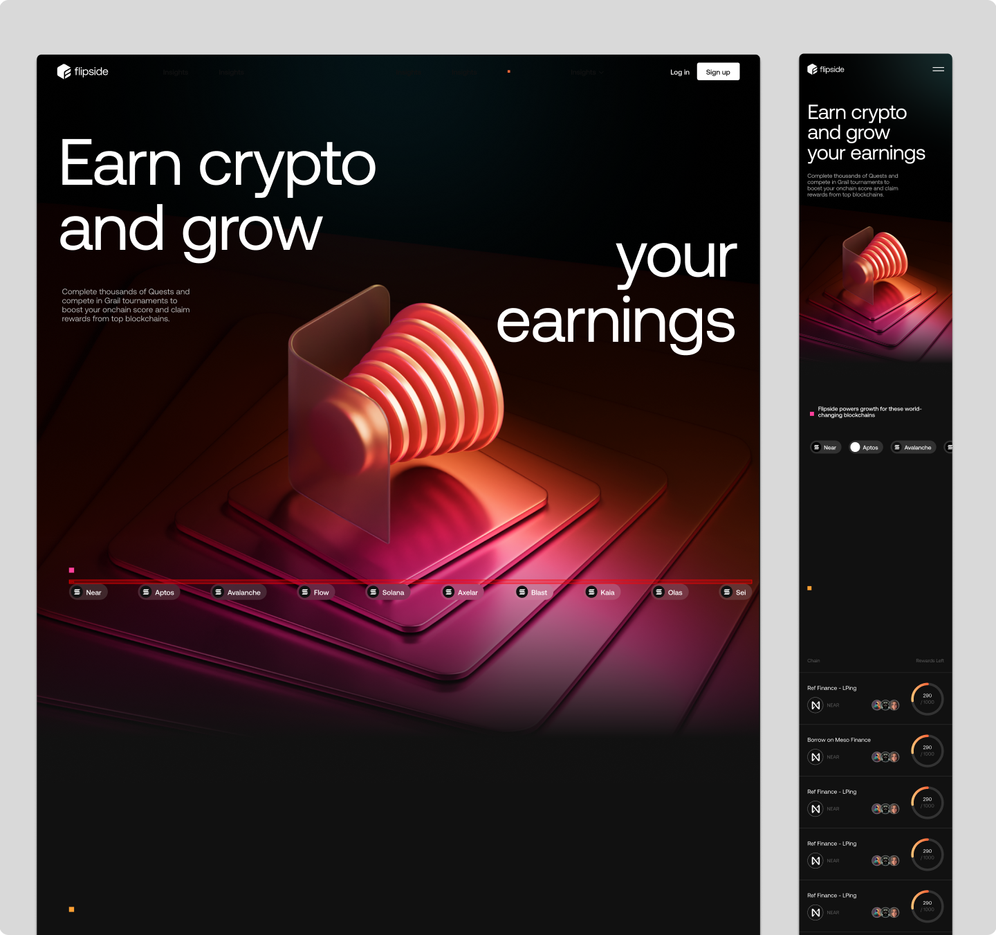
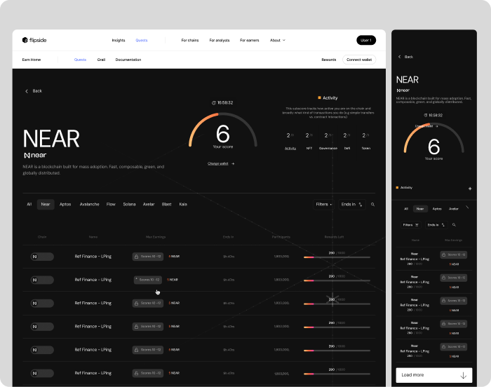
We strategically utilized the natural viewing patterns of users by placing key information from left to right, starting from the top left corner of the screen, which naturally garners more attention. This alignment was based on the standard reading patterns of our primary user base, while also considering variations for users from regions with different reading directions, such as Arabic and Japanese readers. The use of grids and thoughtful placement of content ensured that the design was not only aesthetically pleasing but also highly functional, allowing users to navigate the wealth of information effortlessly and intuitively. This rational and user-centered approach to layout and flow significantly enhanced the overall user experience of the Skywards members section.
The first part of the study was to get an idea of what the stakeholders wanted out of this redesign. Understanding from this perspective allowed me to understand the perpective and conducting sompetotive analyse with stakeholders to accuratly get a gauage of where we saw the company in the market. Gettign stakeholders in at this earlier stage really helped getting me buy in on the future design changes.
“ Sometimes delight is the things we don't have to think about. “
Turning Empathy into action
After working with stakeholders, surveying competitiors and learning from
What does it mean to gain empathy to a user, to me it’s all about putting myself in the shoes of someone else. Out of this ethos one strong message came from my discussions with users. Our users for the most part were very technical idividuals though they needed help in firstly understanding the platform they joined the platform many times direct from twitter and with an already develpoed idea of wat they need to do. From this i understood that Sometimes delight is the things we dont have to think about.
Design discovery

The first part of the study was to get an idea of what the stakeholders wanted out of this redesign. Several pooling and ideation workshops were needed in order to understand the business perpective. Conducting competitor analyse with stakeholders to accuratly get a gauage of where we saw the company in the market. Gettign stakeholders in at this earlier stage really helped getting me buy in on the future design changes.
Final Design Direction

Setting the Mood
I discovered several significant issues with our user experience. Firstly, we are failing on many levels, starting with the onboarding process. From a UI perspective, there are major issues with hierarchy and consistency, creating a disjointed experience. We also lack the 'golden' handholding experience to guide users through their journey. Additionally, we don't provide feedback for those who complete their journey, and much of our messaging is unclear and difficult to understand.